
This week marks Week 9, which means I’m just three weeks away from Open Studio—and honestly, I’m starting to feel the pressure. Right now, I’ve got two key deliverables on hand: my user testing website and the publication that documents my explorations on how text behaves on-screen. But with the studio setup, I’ve been thinking hard about what else I can actually put on the table to communicate the essence of this project clearly and effectively. I want people to interact with the work, not just look at it.
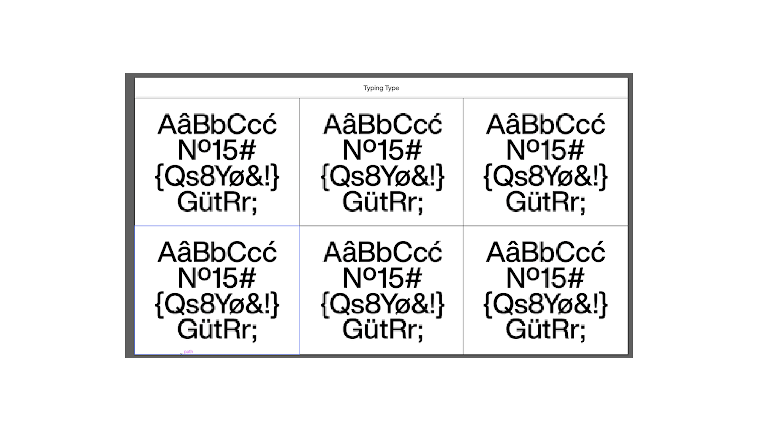
This week, my main focus was starting to code the user testing website. I began by revisiting my earlier sketches, which showed a grid layout of six boxes. Each box would represent one typographic element—kerning, leading, justification, text flow, text wrap, and interactive text. I originally sketched this out just to visualize the structure, but now it’s starting to take shape on screen.
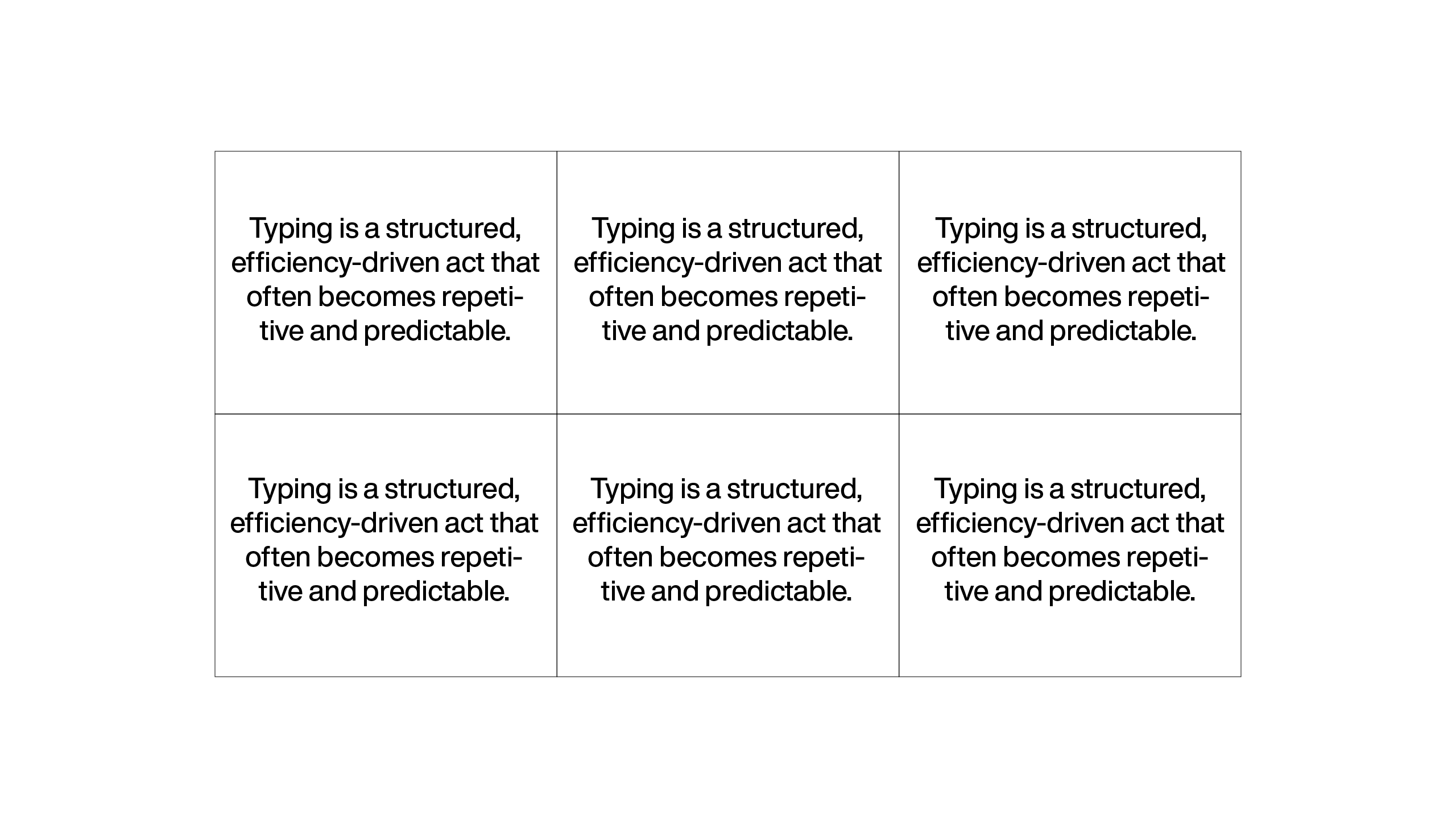
Once I had the basic structure coded out, I changed the placeholder text that would appear in each box. Originally, I had generic placeholder text like “Aa Bb Cc,” but I realized that wasn’t meaningful enough in the context of my project. Since my project centers on how typing is often repetitive and rigid, I changed the placeholder to the line: “Typing is a structured, efficiency-driven act that often becomes repetitive and predictable.” This line is not only related my design statement, but also a concept that viewers can interact with directly—so it made perfect sense for it to become the main text used throughout the website.
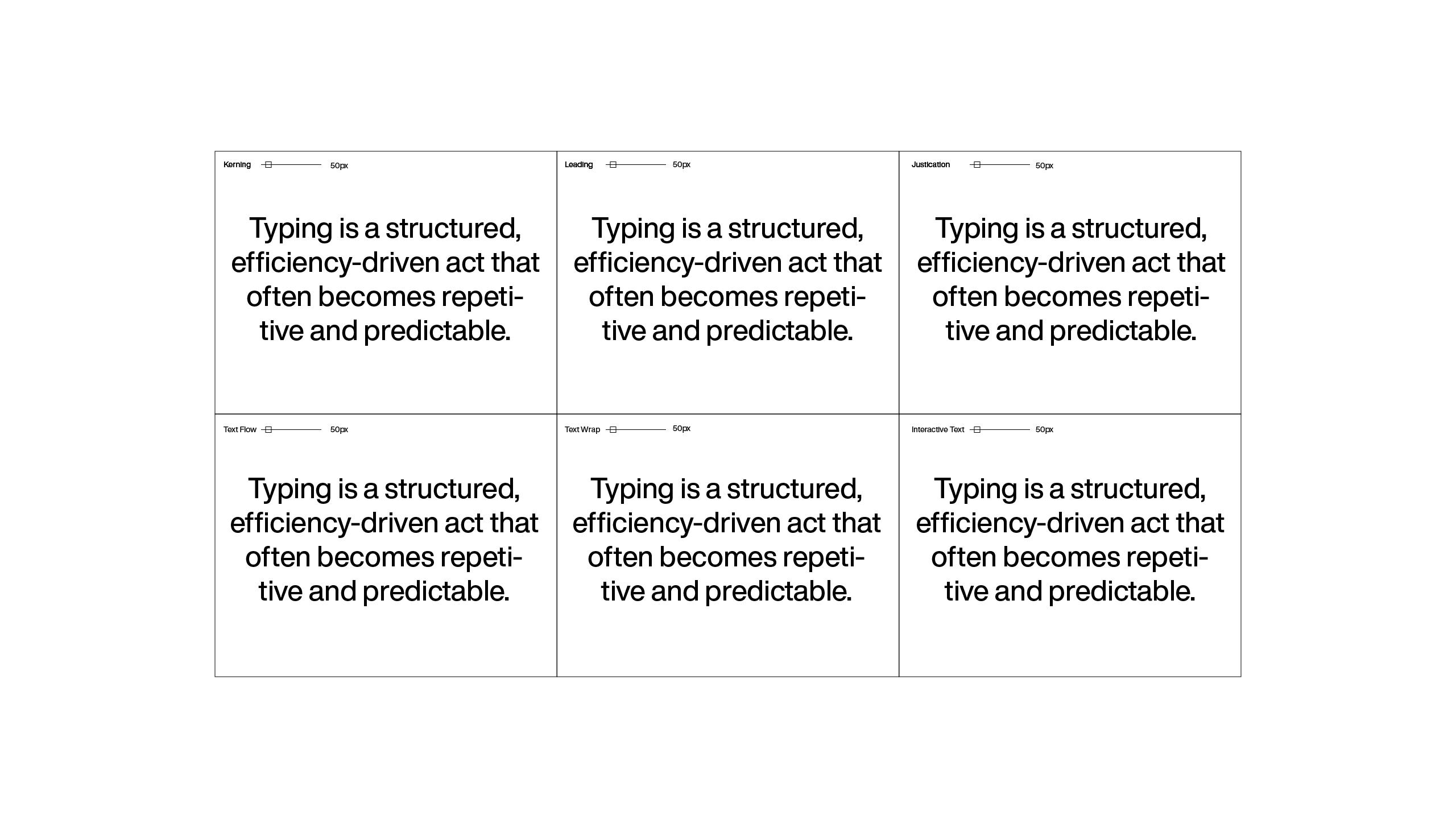
After locking in the placeholder, I added headers to each of the six boxes to label what each one is showcasing. That’s when I realized that without proper labeling, the interactions might get confusing for users who aren't familiar with typography fundamentals. These labels—Kerning, Leading, Justification, etc.—now sit at the top of each text box so viewers can immediately understand what typographic property they’re interacting with.
Next came the trickier part: implementing sliders to control the properties. I wanted each box to have a slider that users could drag to dynamically manipulate the typography—such as adjusting the kerning or line spacing. I knew that for this to work, I’d need to dive into JavaScript, which admittedly isn’t my strongest area. But after a few days of trial and error, I successfully coded a functional slider that adjusts the size of the text in real time. What’s interesting is that as users decrease the text size using the slider, the word count naturally increases, mimicking what we often see on type foundry websites. That small detail actually helps the whole experience feel a lot more polished and intentional.
But I didn’t stop there—I wanted to make sure the website wasn’t just a static display of typographic changes. I also made the text editable. Users can now click on the placeholder text and type their own words, which will then behave according to the typographic properties of the box they’re in. This brings in a layer of interactivity that aligns directly with the core of my project: typing as an experience, not just a means to an end.
To further enhance the interaction, I implemented a hover feature. When users hover over a particular box—say, the “Kerning” box—the text inside will change to display the word “kerning” or briefly describe what kerning is doing in that specific box. This feature might seem subtle, but I think it’s a nice balance between being informative and engaging without overcrowding the interface with too much explanation.
Overall, I’m quite happy with the progress this week. The site is finally starting to feel like more than just a prototype—it’s becoming something people can really play with and reflect on. That said, I’m still thinking about what else I could include for the Open Studio table. Maybe I could add an additional small zine, or a printed quick-start guide to help people navigate the user testing experience. But for now, I’m focusing on finishing the coding and making sure the interactions feel smooth and responsive.
This website isn’t just a demo—it’s meant to be an actual user experience that reveals how the smallest typographic decisions can shift the way we engage with digital text. And that’s the whole point of my project: challenging how we perceive typing by disrupting its conventional rhythm and presentation.