
During the first week, I just felt like my first experiment was pretty boring, in terms of like the idea itself, I dont know I may be overthinking you see.. So I just rethink and rewrite on a piece of paper which I lost, I wrote down the aim and objectives of my project and I felt like the text flow and text wrap and text interactive was jumping ahead too far, because my project is about typing you see.. And when it comes down to typing, we see the perfect type setting and when I thought of the word type setting, thats where I got my idea, and I went ahead and decided to focus on the fundamentals of typography, so I listed down what were the fundamentals of typography or how can text affect the viewer’s eye, I am not saying that text flow, wrap, and interactive text doesn’t affect but I just felt like I jump too far for that when I could have focus in the first semester was the typing setting so heres the list,Point size, Justification, Kerning, Leading, and Italics/Bold.
So this time, my objectives weren't all about motions or movement but more of text play within the focus of basis typography. Conducting my research in this structured manner provides viewers with a clearer understanding of my explorations. Rather than focusing on text movements or the playfulness of typography, my approach emphasizes experimenting with the fundamental aspects of typography. By doing so, I establish a strong foundation that not only enhances comprehension of my project but also effectively communicates the core ideas I am exploring. While my work ultimately revolves around the act of typing and its fundamental elements, this methodical approach allows for a deeper appreciation of how these basics influence the overall experience and perception of text.
I can start my research by focusing on the fundamentals of typography, such as kerning, leading, alignment, and spacing. These basics shape how text is structured and perceived, so understanding them first will give me a solid foundation before diving into more complex explorations. Once I have a good grasp of these core elements, I can move on to experimenting with movement and interaction—exploring how text shifts, adapts, or responds dynamically while typing. This phase would help me see how typography can be more than just a static form and instead become something that changes and evolves in real time. Finally, I can experiment with patterns in text, looking at how repetition, rhythm, and structure affect the reading and typing experience.
But beyond just playing with typography, the real question is: how can these explorations help create a clearer mind while typing? Can changing the way text looks and moves disrupt habitual typing patterns and encourage a more mindful interaction with words? Could certain patterns or movements make the act of typing feel more fluid, less distracting, and more engaging? Instead of letting people fall into automatic typing habits, can these experiments make them more aware of the process, helping them slow down, focus, and think more intentionally about what they are writing?
At its core, this project isn’t just about making typography look interesting—it’s about seeing if typography can change the way we engage with text as we type. By breaking the usual patterns of how words appear and behave on a screen, maybe it can create a different kind of writing experience—one that feels more intentional, more in-the-moment, and maybe even a little freeing.
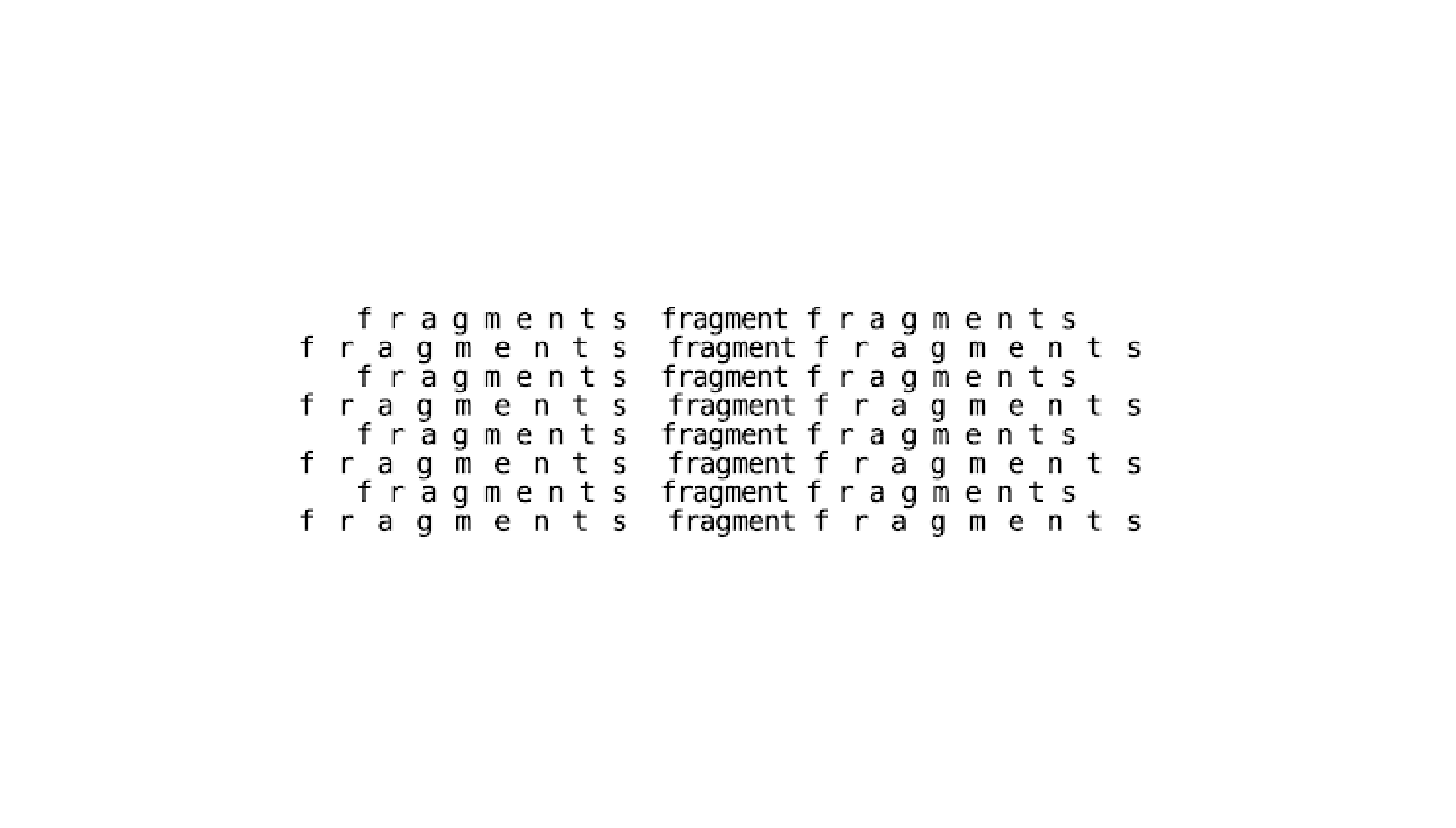
So I did a couple of sketches and experimented with kerning on p5.js, it was what I felt most comfortable with to experiment so my plan here was to create letter spacing with my sketches, so I know there are multiple ways to experiment with kerning and this excites me because I won’t run out of ideas, my plan is to make my experiment have the user interactive with typing, since when user types, it has the perfect type setting so now, I wanna create an unconventional way of typing where it displays a non traditional typesetting by experimenting with kerning, leading, and justification. This was one of the first experiment I touched on with kerning,
Here’s how it works: as the user types, every time they press the spacebar for the third time, the text automatically moves to the next line. The spacing between words also follows a pattern— the first spacebar press creates a wide kerning effect, the second spacebar keeps the spacing normal, and the third spacebar goes back to wide kerning again. This cycle repeats, forming a rhythmic pattern in the way the text is spaced and arranged on the screen. This was one of my first experiments with kerning, and I actually really enjoyed it. At first, I was just trying to create a structured way of spacing text, but as I played around with it, I realized the pattern of alternating kerning and line breaks gave the text a nice rhythm. The way the words shifted between wide and normal spacing made typing feel less automatic and more intentional.
What I liked most was how the interaction shaped the outcome. Instead of manually adjusting each letter, the system decided how the text would form based on how I typed. That made me think more about how simple rules like this can break the usual way we type. The little disruptions in spacing encouraged me to slow down and be more aware of what I was typing, which fits right into my goal of making typing feel more experimental and engaging. Overall, this sketch gave me a clearer sense of direction. It showed me how even small changes in kerning and movement can influence how we engage with text, and I’m excited to push this idea further in my next experiments.
This code lets me type text, and as I type, the spacing between the letters changes in a wave-like pattern. Instead of a fixed kerning, the spacing expands and contracts based on a sine function (sin((i + j) * waveFrequency) * kerningWaveAmplitude), making the letters feel like they’re flowing instead of just sitting in a straight line. The text starts at a set margin (margin = 100) and moves line by line with a fixed space between them (leading = 22), ensuring everything stays within the canvas. If I press backspace, it removes the last character (typedText.slice(0, -1)), and everything updates in real time with redraw(). The whole thing creates this rhythmic effect where the text doesn’t just appear statically but moves in a way that feels more alive.
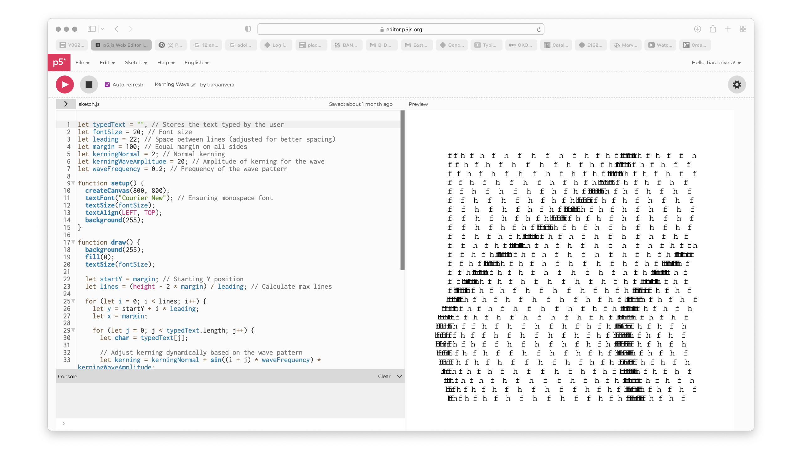
For this sketch, I did get a little help from ChatGPT, but I’m really happy with how it turned out. Seeing the text move in a wave-like pattern made me appreciate how something as simple as kerning can completely change the feel of typing. It’s not just about spacing—it’s about creating a rhythm, making the text feel more dynamic and alive. I also realized that I want to experiment even more with kerning, pushing it further to see what other patterns or effects I can create. Doing this reflection helped a lot because it made me more confident in my project's direction. Now, I feel more assured about what I’m excited to keep going with it. I did a presentation this week too and I'll add it here.