
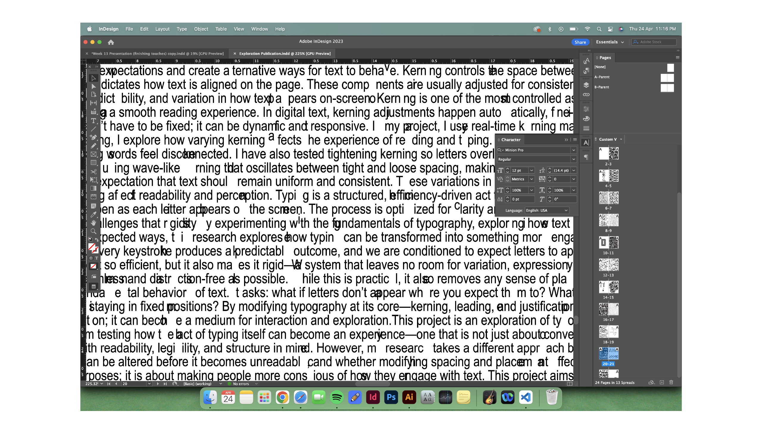
I completed two new p5.js sketches this week. The first one (image above) plays with the concept of bad kerning. At first glance, it looks like a conventional typing interaction, but as you type, each word appears with awkward, randomly generated spacing between letters. This makes reading feel uncomfortable and forces the user to slow down. It’s a subtle interruption—less chaotic than my other sketches—but that’s the point. Sometimes disruption doesn’t have to be loud; it just needs to make people notice something they’ve taken for granted.
Even though this isn’t something you’d use in a professional typesetting context, it reflects the core spirit of my project: to disrupt, reframe, and provoke reflection on digital typing norms. When you feel the friction—when something doesn’t “flow” the way you expect—it’s a prompt to pause and rethink your habitual workflow.
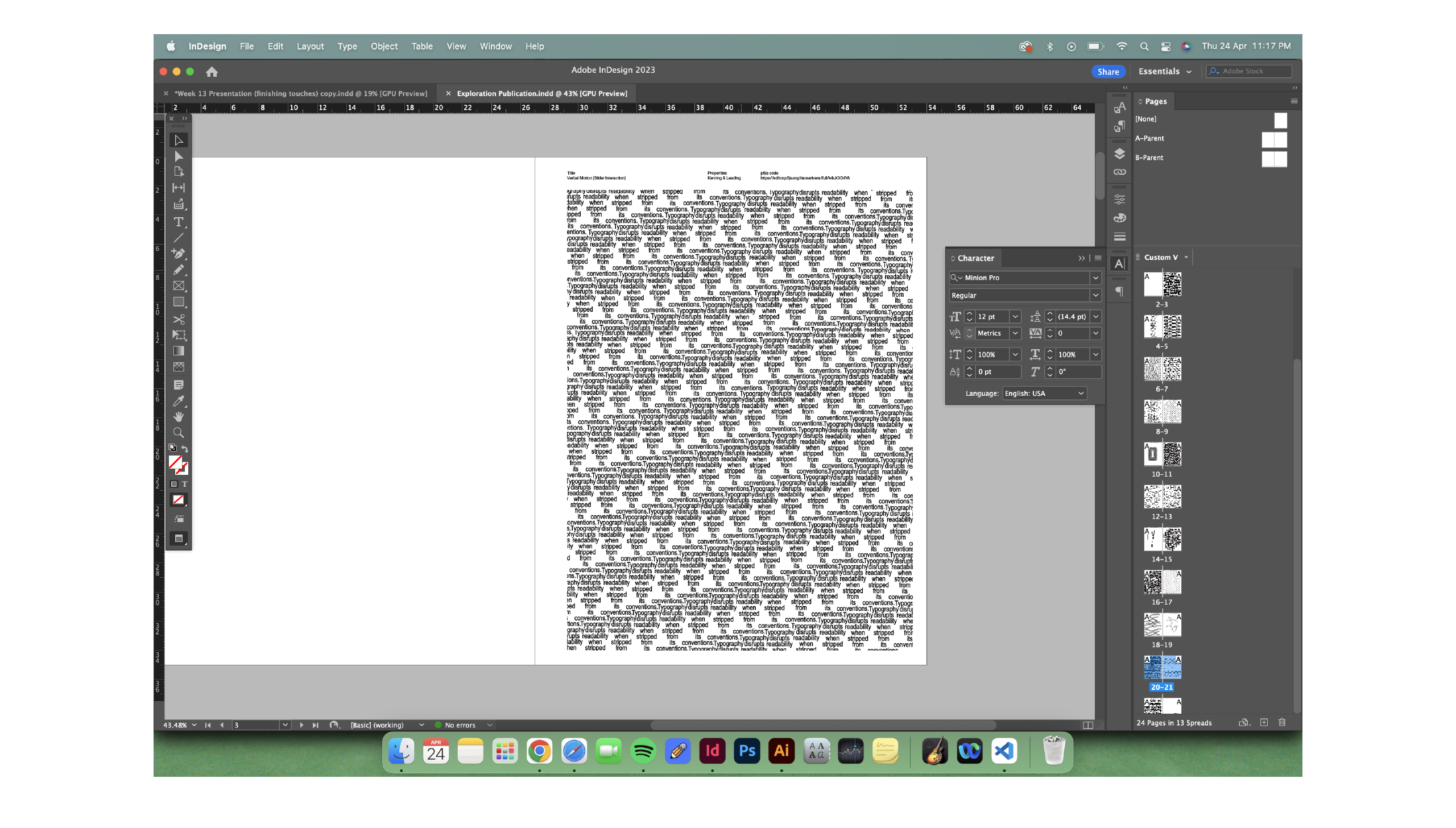
The second sketch (image above) uses sliders to let the user manipulate text structure in real-time. The sentence “Typography disrupts readability when stripped from its conventions.” is repeated over and over again in a grid, but users can modify the number of columns and the speed at which words appear. As the slider is adjusted, the legibility, spacing, and density shift dramatically, creating a sense of rhythm and motion. There’s something hypnotic about seeing the structure deform with just a tiny input. To me, this felt like a satisfying way to represent how even small interventions can radically shift how we interpret text.
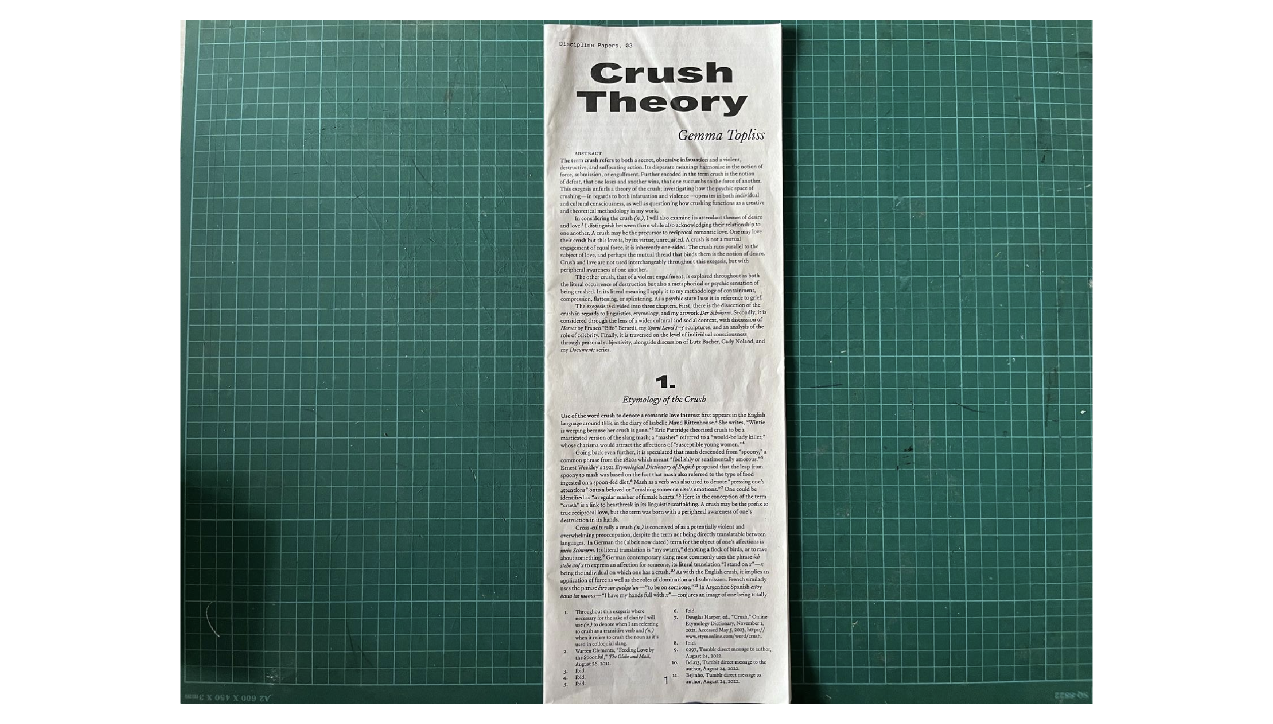
Inside, I kept the same energy. Inspired by Crush Theory (image below) publications, I arranged the pages in a narrow, text-heavy format that felt almost overwhelming at first glance. This wasn’t accidental—it mirrored the idea of typographic tension and overload. The body of the publication is printed on long A3 paper, folded in half. I did two test prints—one on 80gsm and one on 100gsm. I consulted Vikas on this, and he recommended 80gsm because thinner paper creates a tighter bind. Thicker paper might look more premium, but it risks falling apart without proper stitching.
At first, I was considering a saddle stitch, but I realized that between the rush to finish coding and figuring out the layout, I didn’t have the capacity to commit to stitching by hand. So, I printed both versions, leaving the final decision for later. Honestly, it wasn’t bad time management—it was more that everything was happening at once, and I had to prioritize what felt most urgent.
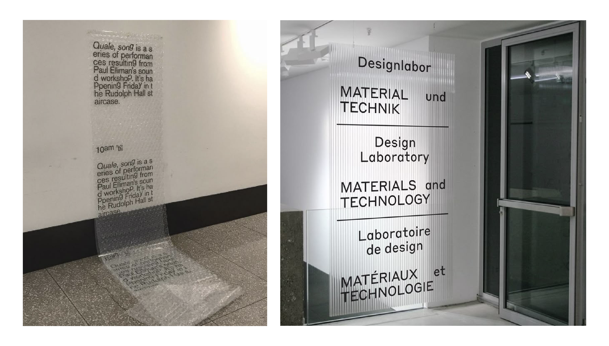
Another insight from Open Studio was that people weren’t reading the description of my work, even though it was clearly placed next to the publication. That really made me reflect: maybe it wasn’t about placement, but presentation. So this week, I looked for ways to make the description stand out more. I came across a photo (pic above) of a text piece printed on bubble wrap, and it got me thinking—why not try printing my description on a transparent material?
Instead of just laying it flat beside the book, I could mount it vertically, so the text floats in space. This would visually connect it to the publication and signal its importance more clearly.
While I managed to finish the sketches for the publication, I didn’t get around to completing the explainer web. Honestly, I was stuck and frustrated. I tried to troubleshoot with ChatGPT, but as the code became more complex, it got harder to explain what exactly I needed help with. Most of the time, ChatGPT didn’t understand the specific context of my problem, especially with interactions between overlapping code components. It was mentally draining, so I decided to pause and step away for a bit. I think taking that break was the right move. I was forcing myself to figure everything out at once, and it was starting to affect my creative energy. I’m planning to revisit the explainer web once I have more space to breathe and can look at it with fresh eyes.
I’m honestly tired. Not in a bad way—just the kind of tired that comes from pouring yourself into something, tweaking and refining, even when parts of it still don’t fully work the way you want. But I’ve accepted that this project doesn’t need a clean ending. It was never about getting everything perfect anyway. If anything, this feels like the start of something I could keep building on—some kind of toolbox for future ideas.