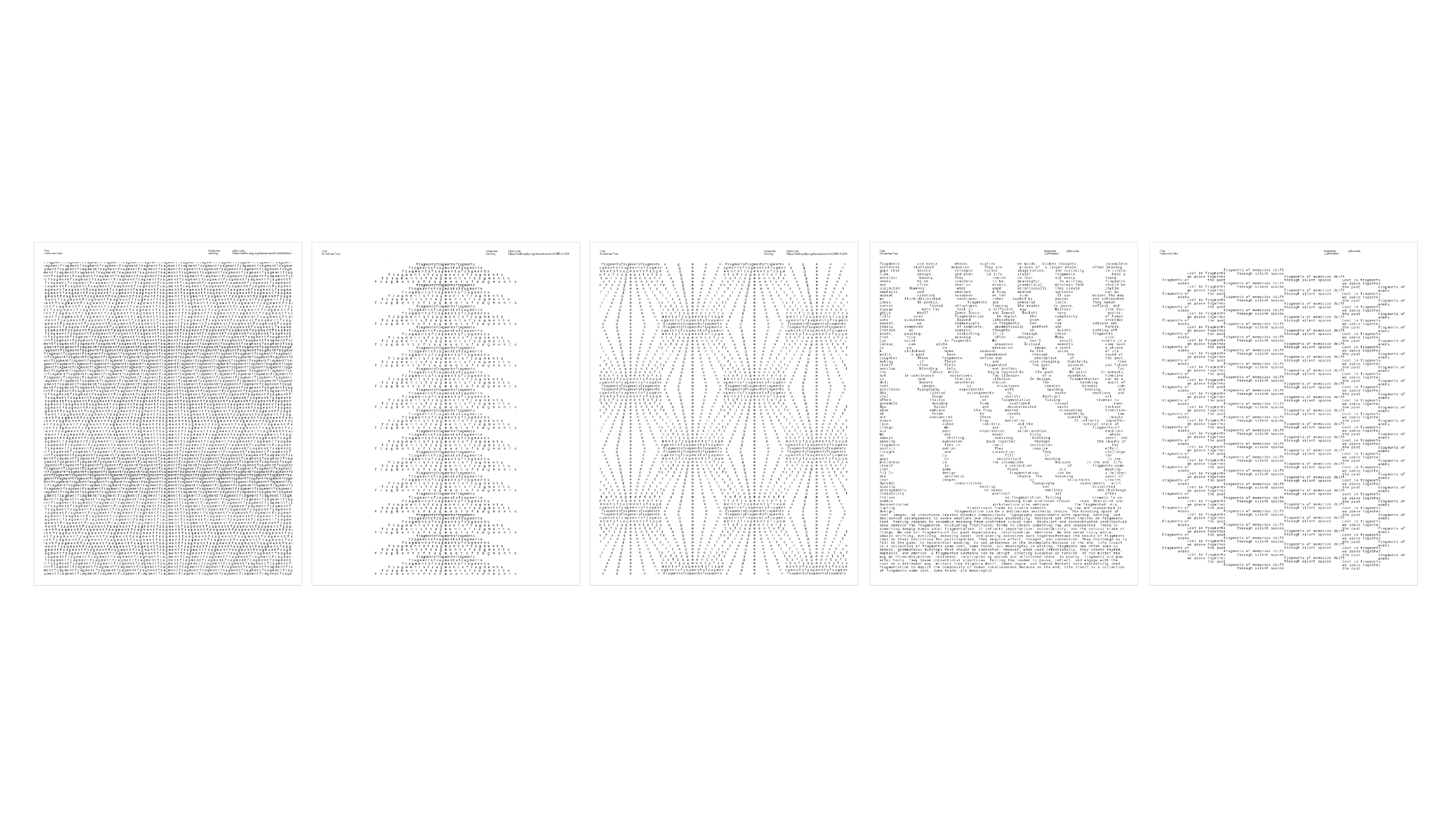
This week was mainly focused on preparing for the presentation, as well as finalizing the work leading up to the dissertation submission. Since I didn’t have much time due to my dissertation, I concentrated on refining my mockups, preparing my artist statement, and structuring my presentation. One of the key things I worked on was printing out mockups of my publication to see how the pages would look on paper. This was something Vikas had suggested in a previous discussion, and seeing the printed versions helped me understand how my text placement experiments translate to physical form. The first image shows some of the printed pages, where I tested different text placements and patterns. It was important to see how the compositions work in print, as certain visual effects appear different on paper compared to the screen.

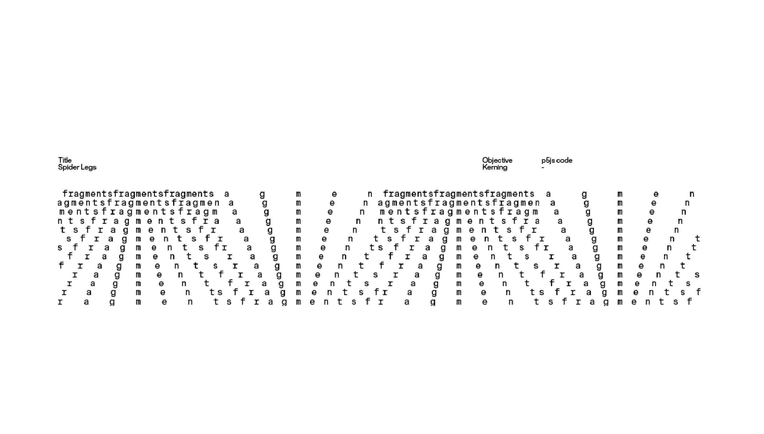
A major feature I had planned for my publication was linking the pages to the actual p5.js sketches through the p5.js links. This would allow readers to not only view the experiments in print but also interact with them digitally. The second image shows an example of how this is incorporated, where the p5.js link is displayed on the page so that viewers can test the sketch themselves. However, while preparing my presentation, I started questioning whether I would be able to create that many working codes in time for the final submission. Initially, I had the idea of generating multiple sketches for different variations of kerning, leading, and justification, but after reviewing my workload, I’m considering focusing on fewer, more refined interactive sketches.

For the presentation, I kept the focus on my core concept: challenging the predictable nature of typing by experimenting with the fundamental rules of typography. My artist statement, which was a key part of the presentation, explains this clearly: "Typing is a structured, efficiency-driven act that often becomes repetitive and predictable. This project challenges that rigidity by experimenting with the ‘fundamentals’ of typography, exploring how text can behave dynamically as it is typed on-screen." I also discussed how my approach has evolved over time. In the previous semester, I was more focused on text movement, interactivity, and wrapping, but this semester, I’ve shifted my focus towards fundamentals like kerning, leading, and justification. Instead of just exploring how text moves, I’m now interested in how the act of typing itself can shape the way text appears on-screen.
In the presentation, I showed several explorations in p5.js, demonstrating different ways I’ve manipulated kerning dynamically. Some sketches explore uniform kerning to create structured block-like text arrangements, while others introduce wave-like kerning effects that distort text into shifting patterns. One of the sketches generates a triangular arrangement by adjusting kerning based on line position, while another creates a symmetrical expansion and contraction effect across the canvas. These experiments highlight how real-time adjustments to spacing can impact how we perceive and interact with text.
I also discussed my plan to compile all these explorations into a publication, which will document the different directions my project can take. Since my work can branch out in multiple ways, I want to consolidate the outcomes into a structured format that showcases multiple perspectives on digital typography. The publication won’t just serve as documentation—it will also highlight the various possibilities that emerge from rethinking how text appears and behaves dynamically as we type.
One of the last things I covered in the presentation was the idea of developing a user testing website where people can actively manipulate typographic elements like kerning, leading, and justification. This would allow users to type freely and experiment with different settings, giving them control over how their text appears. However, this is something I need to consider further, as I may not have the time to develop a fully functional version before submission.
I also spent time working on my placeholder text, especially after Vikas’ feedback about making sure it directly relates to my project. Instead of using random or purely aesthetic text, I wanted the placeholder to serve a purpose—something that reflects the core ideas of my research.
To refine this, I started by creating a series of guiding questions about my project. These questions are meant to frame the way I think about my work and also help viewers engage with the experiments on a deeper level. By structuring the placeholder text around these questions, it reinforces the themes of my project while still allowing for flexibility in how the text is presented.
Explain Objective: Typing is a structured, efficiency-driven act that often becomes repetitive and predictable. This project challenges that rigidity by experimenting with the ‘fundamentals’ of typography, exploring how text can behave dynamically as it is typed on-screen. Do talk about the habitual patterns humans have when it comes to typing, we know what's going to happen, it is predictable hence, Typing Type is a way to explore alternative ways for how text can be presented on-screen
What exactly am I trying to do with this research?
Why did I choose to explore these specific typography fundamentals?
How does my project challenge the usual way text is presented and interacted with?
Kerning
What is kerning?
Does messing with letter spacing make the text more dynamic or harder to read?
How does my kerning experimentation differ from typical typography rules?
Leading
What is leading?
How does adjusting the space between lines change how my text looks and feels?
What happens to readability when I mess with leading?
Does tight leading feel more structured, and does loose leading feel more free-flowing?
Justification
What is justification?
How did I experiment with aligning text in different ways?
What happens when I don’t justify text in the usual way (left, center, right)?
Justification
What is justification?
How did I experiment with aligning text in different ways?
What happens when I don’t justify text in the usual way (left, center, right)?
I think I didn’t really put much thought into my placeholder text at first—I just treated it as something to fill space. But after Vikas’ feedback, I realized it could actually add meaning to my project instead of just being there for the sake of it. Coming up with questions about my work helped me think more about what I’m actually trying to explore. Now, instead of just random text, the placeholder ties back to my ideas, making everything feel more intentional.
