
Link here.
Link here.
This week, I focused on researching how I wanted my publication to look and feel. Since this publication is meant to document and display my experiments with how text can appear on-screen, I wanted to make sure the format itself complements the content. There will be multiple explorations and examples, so I’ve been thinking about how best to present them in a way that makes sense and feels cohesive.
Link here.
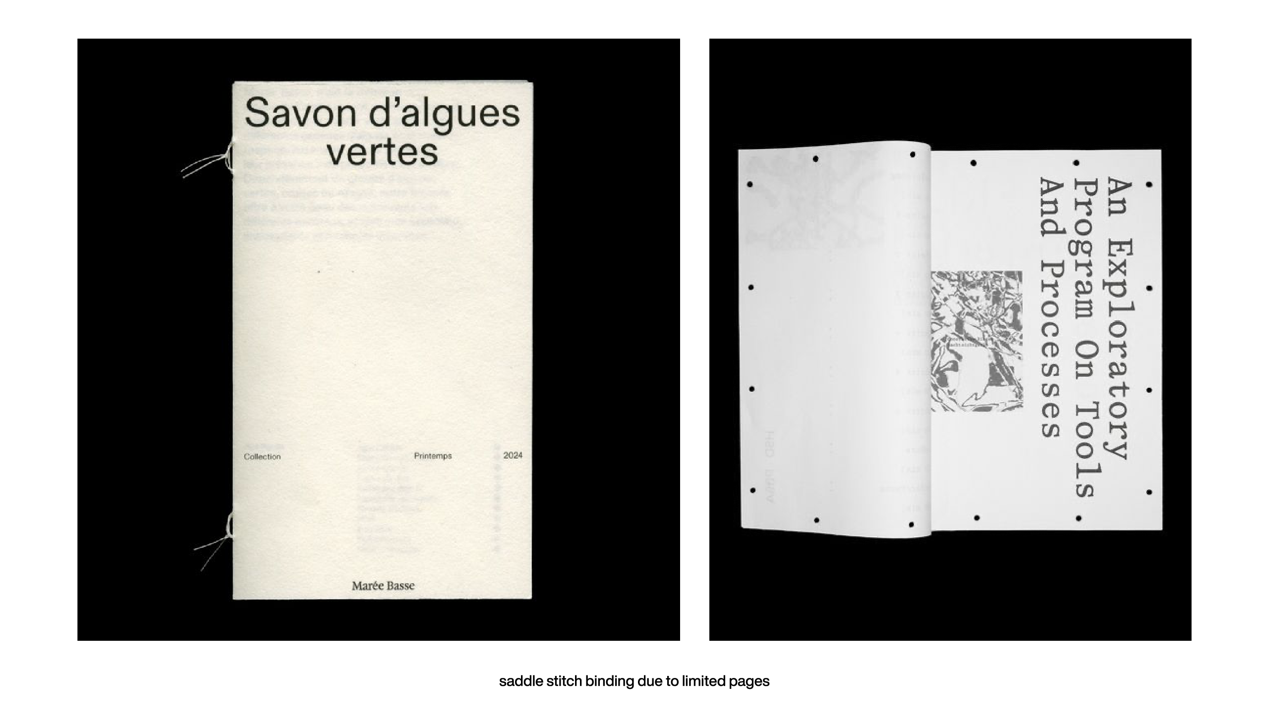
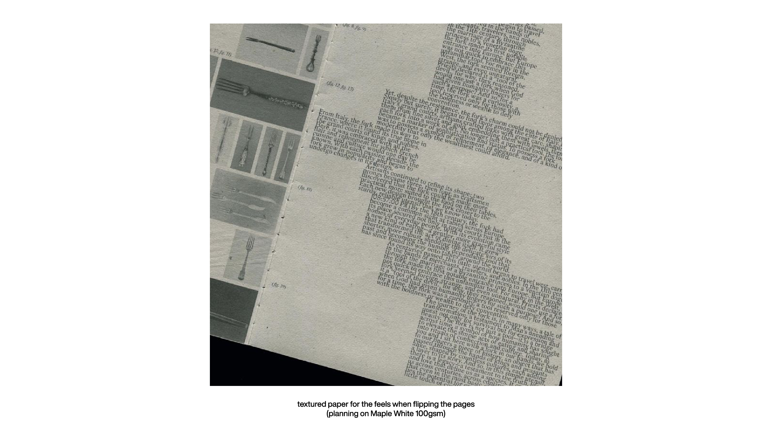
One of the things I spent time on was considering the materiality of the book. I realized that I want a textured paper because it adds character and gives a nice grip when flipping through the pages. I’ve been looking at Maple White from RJ Paper as a possible option since it has a soft yet sturdy feel. As for binding, I’ve decided on a simple saddle stitch tied with a string, similar to the second image I found. The main reason is that I don’t have that many pages, so I don’t need anything overly complex, and I also want the book to open flat for easier viewing. Right now, I’m thinking of making it A3 size, which means printing on A2 sheets. The challenge is finding a print shop that can print on A2 with my own paper, preferably 100gsm, because I want the pages to be soft and easy to flip through.
I also reflected on a previous conversation with Vikas about using an open-spine binding with rough edges. At one point, I really liked the idea of having rough, torn edges, and I even tested different ways to achieve that effect—including using a tearing ruler, which I went ahead and bought. But now that I’ve settled on the direction of my publication, I don’t think rough edges fit the aesthetic I’m going for. That being said, I still want to test it out properly since I already have the tool. Who knows, I might change my mind again.
Now, onto the actual work I did this week. If I’m being honest, I was a bit slow because I had just submitted my dissertation, and I felt really drained. I didn't get as much done as I wanted to, but I did some research and started a couple of new explorations. Next week, I’m planning to properly start my research for the user testing website and do more hands-on work.
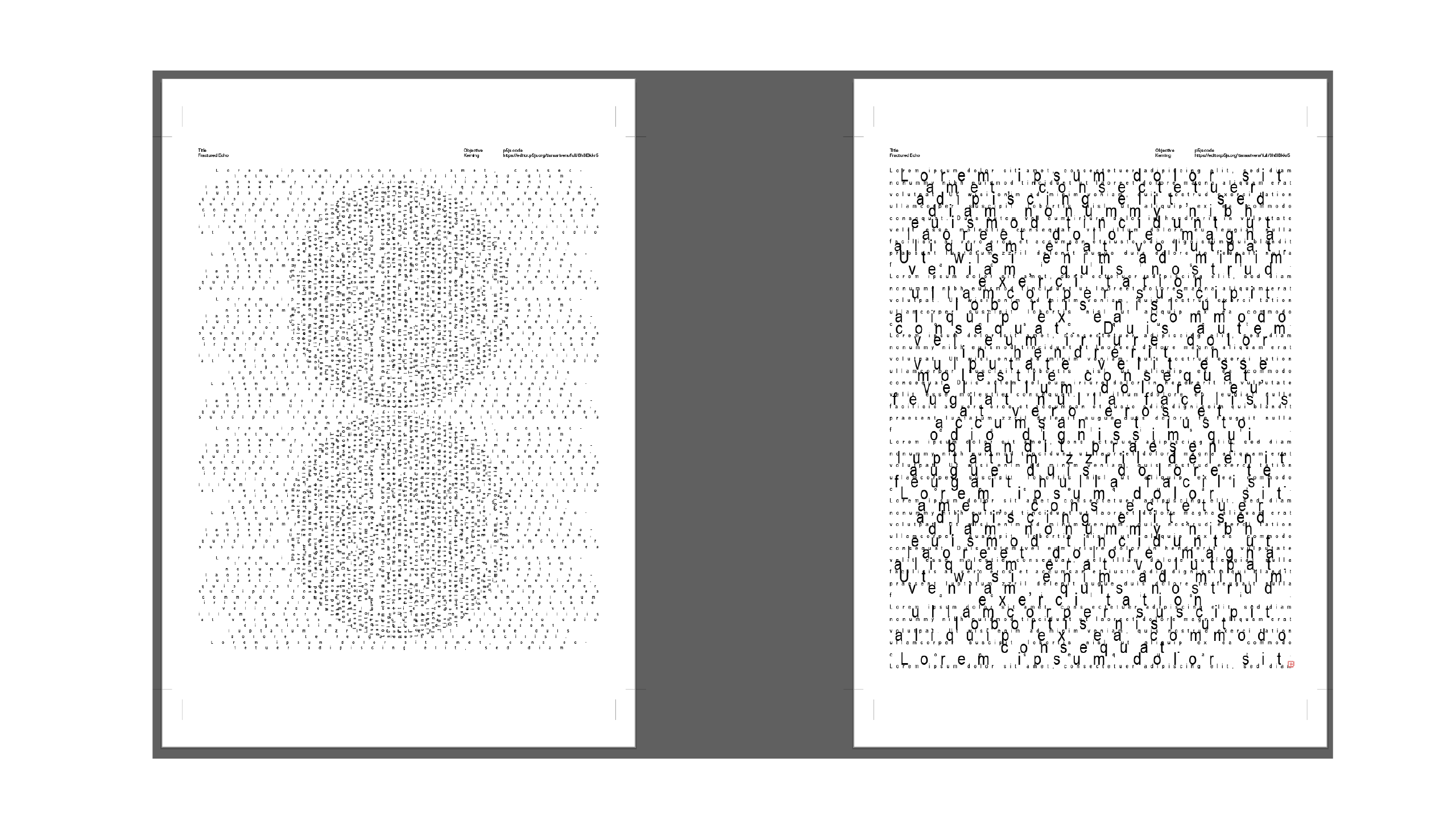
For this week’s explorations, I experimented with kerning and justification. In the fourth image, I played with center justification and inserted a circle, shifting it 90 degrees while keeping the text aligned centrally. It was a simple idea, but it helped me visualize how justification affects text flow in a more dynamic way. In the fifth image, I explored combining different leading values with stacked font sizes. The outcome actually turned out more interesting than I expected, so I think I’ll keep this as part of the publication.
Overall, this week felt more like a prep week. I took the time to reflect on my publication’s material choices, did some minor tests, and figured out what I want to explore further. I didn’t push myself too hard since I was still recovering from the dissertation submission, but next week, I definitely need to pick up the pace and start working on the website properly. There’s still a lot to do, but I think I’m getting a clearer vision of how everything will come together.