
This was the final consultation and it heavily reflective and shaped by the feedback I received during the Open Studio. It was a bittersweet end to the semester—not just because I was sick and unable to fully engage with visitors, but because it forced me to slow down and reassess the way I was communicating my project. I had become so immersed in developing the work that I lost sight of how others were perceiving it.
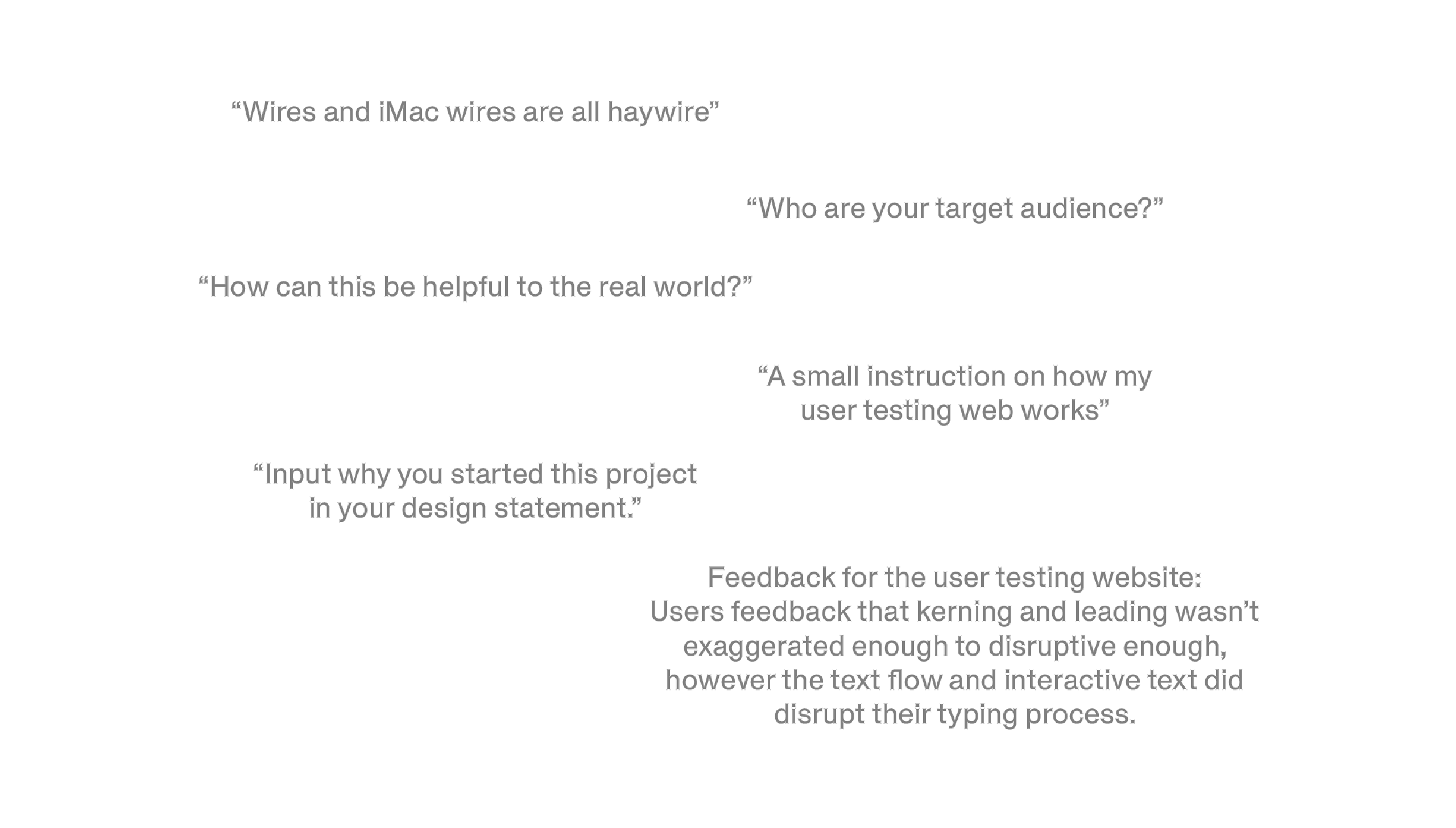
During my last consultation, I focused a lot on how I could improve the way I present the project—not just through visuals, but also through writing, layout, and being clear with my intentions of this project. The Open Studio feedback was split—50% positive, 50% negative—but I decided to focus on the negative responses to improve. One recurring critique was about clarity: “Who is your target audience?” Although I had this somewhat figured out at the start, somewhere along the way I became so absorbed in experimenting that I forgot to anchor my work back to a specific audience. But I wasn't there to answer this particular person as it was a messaged passed to me, I was shocked and I didn't exactly know how to reply.
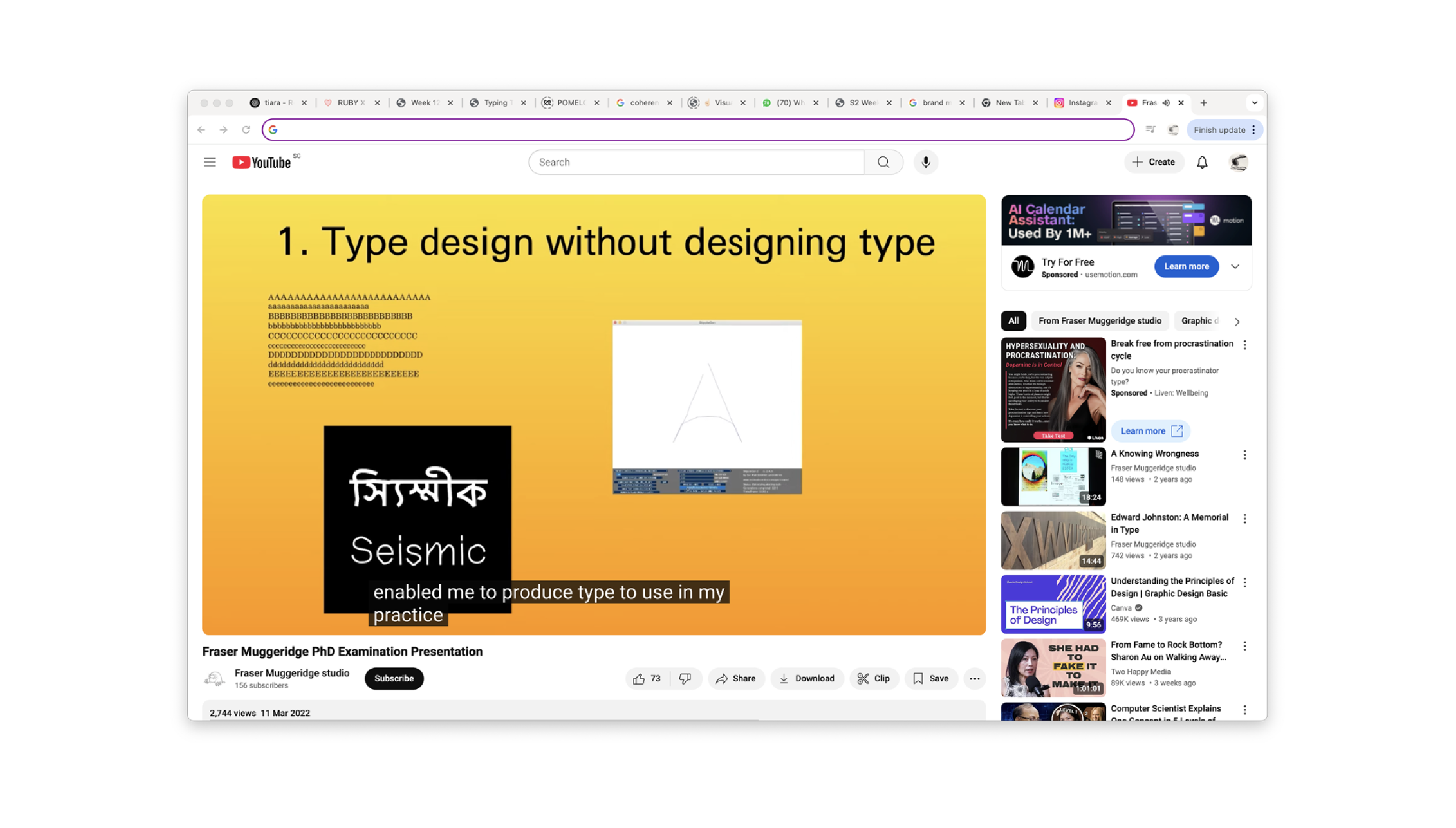
So I took a short break and just decided to watched a presentation by Fraser Muggeridge, a designer whose approach strongly resonates with mine. In that talk, he spoke about “type design without designing type,” and how breaking the traditional rules of typography can actually open up new forms of visual communication. He referred to something called “Wrong Theory”—the idea that rule-breaking can lead to innovation. That really clicked for me. I realized this was always what I was doing, I just hadn’t put it into words yet.
So I went back to why I started this project in the first place. It began during my exchange at RMIT, where I had to choose an overlooked object. I chose the Command key—not because it looked exciting, but because of what it represented: quiet control, overlooked power, and the deeper systems that shape how we design and think. That led me to think about the keyboard, specifically the QWERTY layout. It’s outdated, yet still the default. We accept it because it’s familiar—even though better layouts exist. This sparked a larger question for me: how do habitual tools shape the way we create?
That’s when I redefined my audience. This project is for designers and students who feel stuck in routine workflows. It’s for those looking to rediscover play in their practice, and for educators who want to teach typography in a way that feels interactive, disruptive, and personal. My work isn’t about efficiency—it’s about breaking the expectation that typing must be clean, fast, and invisible.I also rewrote my design statement to reflect this renewed clarity. The updated version focuses on the concept of “productive disruption”—the idea that by intentionally interrupting typing routines, we can unlock new creative pathways. My updated design statement:
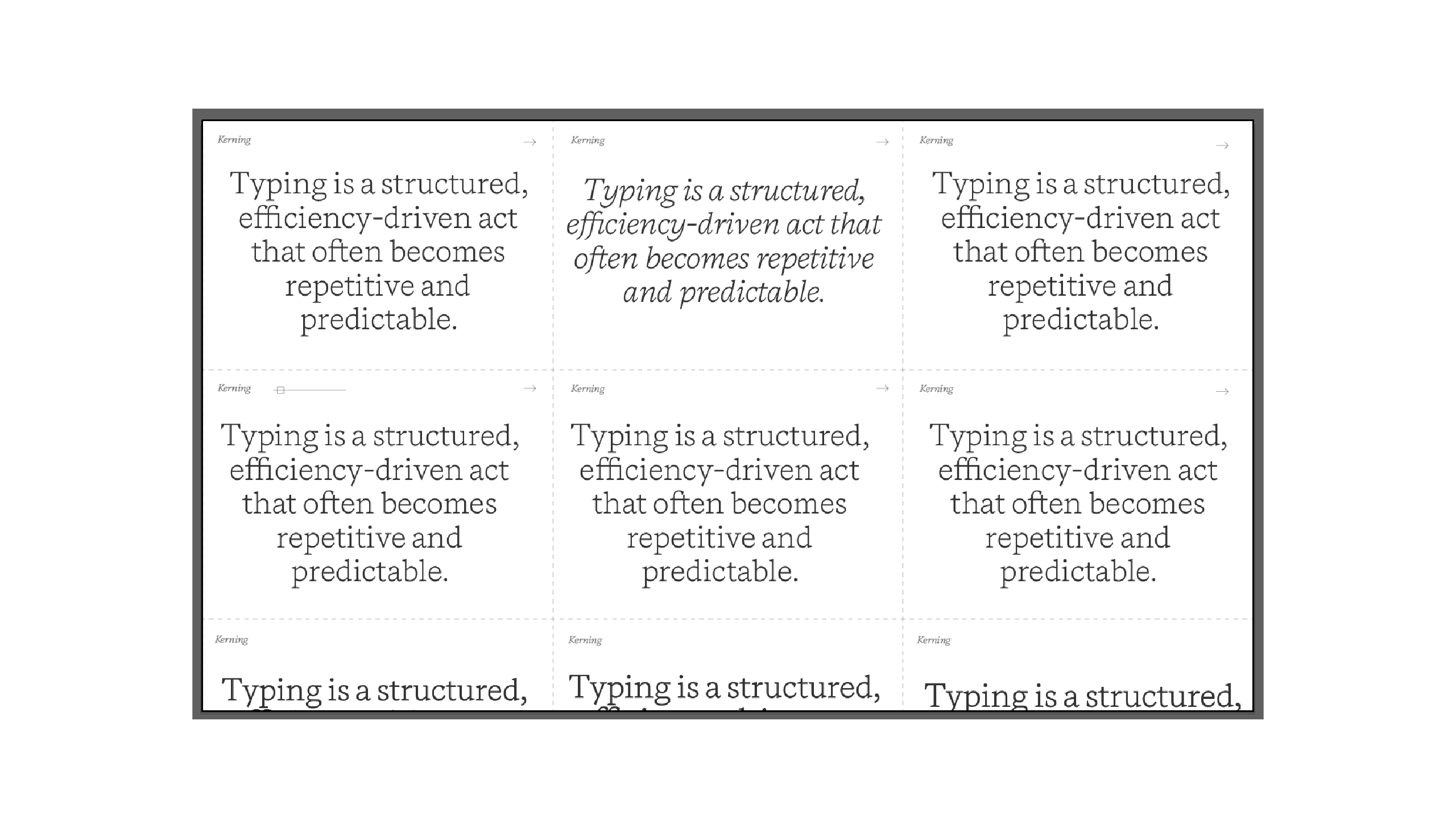
“In today’s digital landscape, typing has become a routine, efficiency-driven task, often leading to predictable and uninspired outcomes. By introducing intentional ‘productive disruptions’, this project primarily focuses on disrupting the typing process by experimenting with unconventional applications of fundamental typographic principles to rejuvenate the creative workflow, thereby stimulating innovative thinking and fostering the development of thought-provoking designs.”
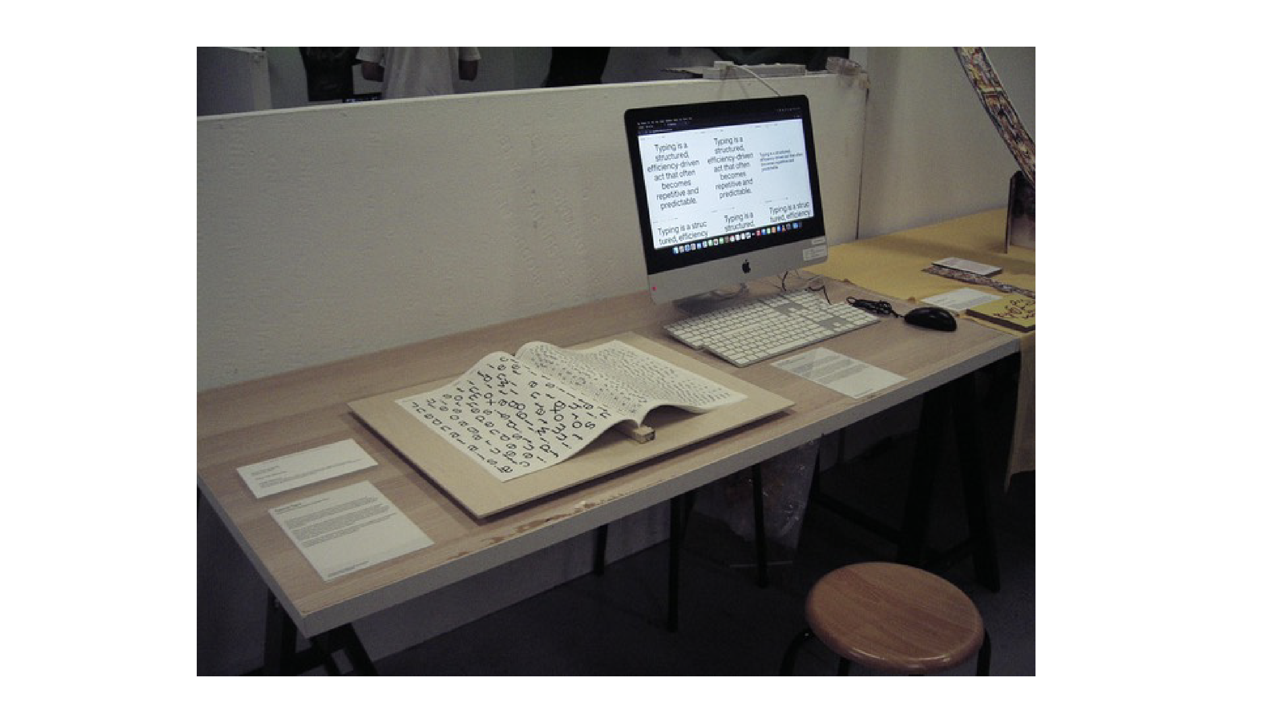
At Open Studio, I wasn’t able to explain all of this properly because I was sick and left early. That taught me a huge lesson: I needed more visual aids, better instructions, and a stronger narrative. Some people said my explainer website wasn’t clear enough—so I’m now planning to add a small paper instruction label with step-by-step directions. I also realized the visual design across my deliverables wasn’t cohesive. Even though I was home resting for most of that week, I took the time to think about how to improve things. I worked more on my user testing website and explored how to expand it further. One of my goals is to let users adjust variables like kerning, justification, leading—so they can feel how text reacts in real time. This hands-on interaction reinforces my project’s message better than static examples ever could.
Another key deliverable is my Typing Type Catalog of Making — a collection that traces the step-by-step development of my project. It documents all the experimentations and tasks I explored along the way, showing how my ideas evolved through experiments with typography, movement, and interaction. This catalog is designed not just to showcase the outcomes, but to offer a clearer understanding of my creative process, my shifts in thinking, and how the project gradually took shape.
This week, I added five more sketches to the publication.
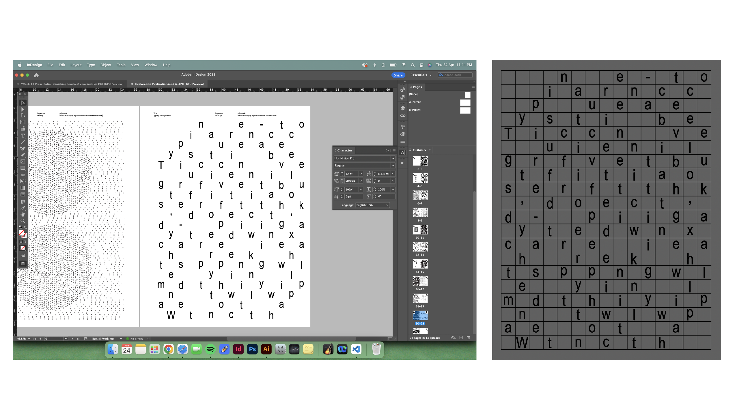
Inspired by traditional text wrap, but instead of text flowing inside a shape, the letters go around the perimeter. I referenced a version I drew on Illustrator before translating it into code.
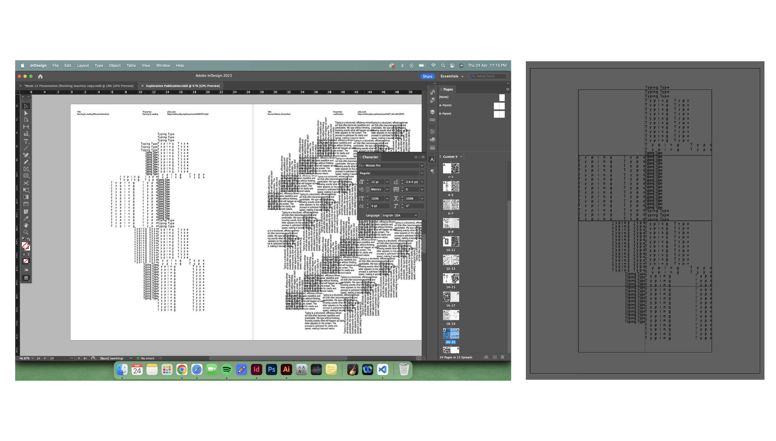
Focused on kerning and leading using slider controls. I added speed to make the movement more fluid, creating a hypnotic effect. It's not the cleanest code, but it I just wanted to explore using sliders instead of typing it out always.
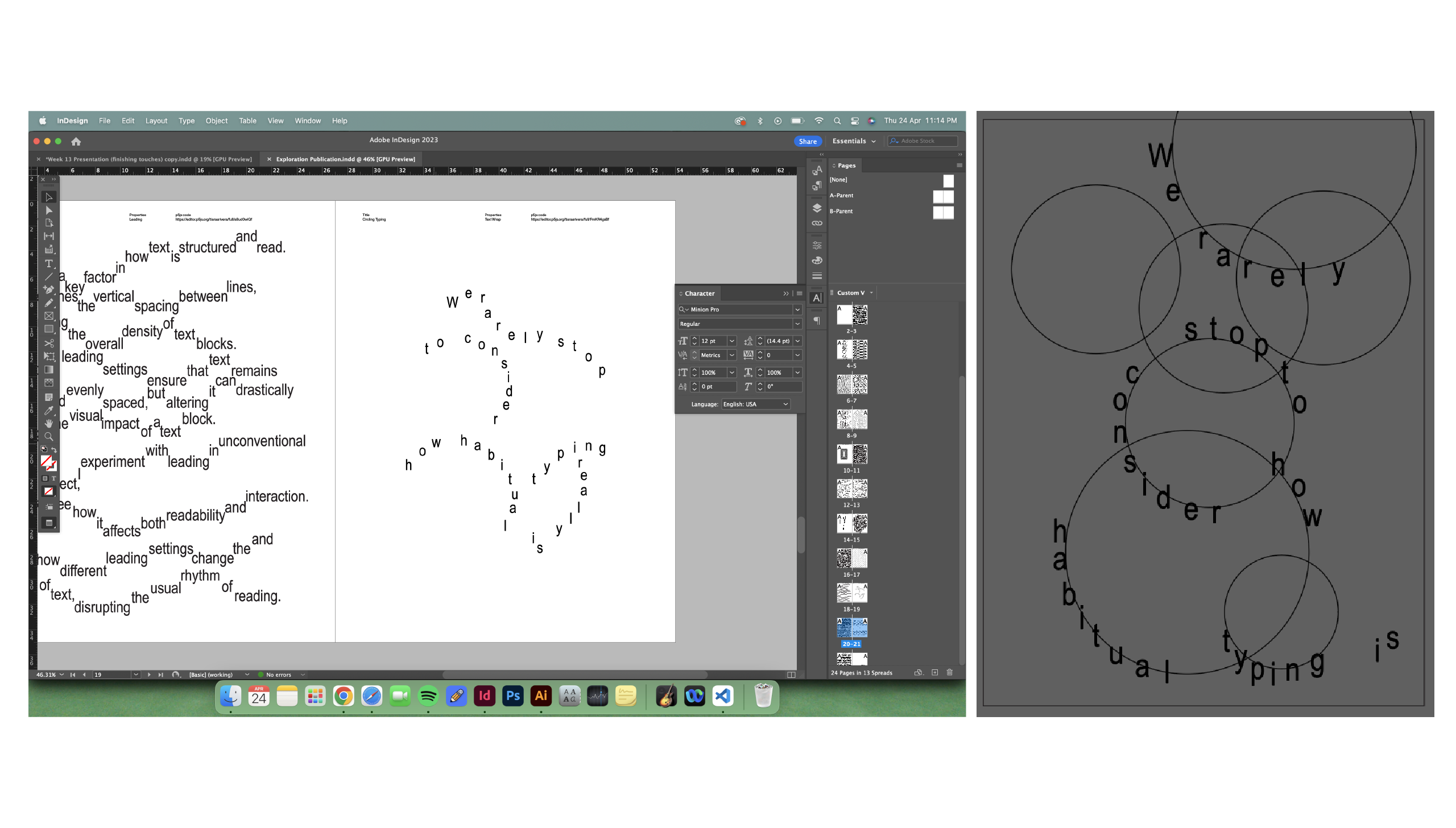
I wanted to see what happens when text moves diagonally across a circle. My first sketch was slightly off, so I redid the grid alignment and now it reads more cleanly, flowing the flow of the user's eyes.
Some sketches respond to typing input. Others respond to sliders. A few remain as WIPs. But what they all share is a goal: to challenge the predictability of digital typing and turn it into something more expressive, reactive, and chaotic. These aren’t practical for typesetting real-world documents—and that’s the point. They ask us to reconsider what typing can feel like.
Overall, this week was about reconnecting with my intentions and shaping the final form of my work. Through reflection, revision, and continued experimentation, I’m ending the semester with a stronger understanding of what I want my audience to take away. This project began as a small critique of the Command key, and evolved into a full-on exploration of how deeply habits shape our tools—and how breaking them can reveal something new.
This week was a reflective turning point for me. After receiving mixed feedback at Open Studio, I had to re-evaluate how clearly I was communicating the intent and value of my project. The main takeaway was the need to clarify my audience and improve the delivery of my ideas. Watching Fraser Muggeridge’s talk reminded me of my original motivation—how overlooked design tools like the Command key shape creative routines. I rewrote my design statement to reconnect with that foundation and refined my deliverables to better showcase the purpose of my typographic disruptions. Despite being unwell, I made progress on reflecting on my project which helped me a lot on knowing how to better communicate my project.