
This week, I didn’t get as much done as I would have liked because I was really focused on my dissertation, but I still managed to make some progress on my publication research and typographic experiments. Even though I didn’t do much hands-on work, I had some interesting findings that helped me think deeper about my project.
One of the most eye-opening readings I came across was about Han Gao, a designer who explores text and reading as his main method for creating. He’s really obsessed with how text influences the way audiences interact with visual works, which I think relates a lot to my own project. His approach focuses on how the act of reading itself changes depending on how text is placed, formatted, or structured. This made me reflect on my own work because I’ve been so focused on how text looks dynamically on screen, but I hadn’t thought as much about how people actually engage with it as they read. His work made me wonder—does my project change the way someone reads and experiences text, or am I just making something visually interesting? I think I need to find a way to balance both. This was a good reminder that text isn't just a design element—it’s something people interact with, so I should consider how my placements influence the reading experience itself.
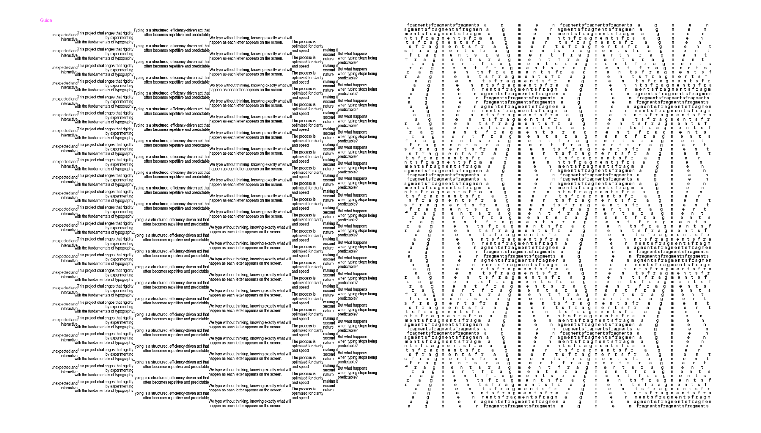
Aside from that, I also spent some time experimenting with text placements in Illustrator, just playing around with kerning and spacing to see how I could make text visually dynamic. The images I attached show two different approaches I was testing.
The first experiment explores kerning as a way to create structured but fluid patterns. By manipulating the spacing between each letter, I was able to create a wave-like distortion, making the text look like it’s shifting across the page. What I like about this is that even though the letters remain in a grid-like structure, the subtle changes in kerning give it movement, almost like an optical illusion.
The second experiment plays more with fragmented repetition. I wanted to see how text could be arranged in a way that feels layered and rhythmic, almost like a texture. Instead of treating the text as single, clear lines, I experimented with overlapping phrases and uneven spacing, making the words interact with each other in an unpredictable way. This approach makes the text feel more immersive, like a dense field of words rather than just something to be read from left to right. I think this experiment was successful because it makes the viewer engage differently—they can’t just read it in a straightforward way, they have to navigate through the placement itself.
Even though I didn’t produce as much as I wanted this week, I feel like the research and experiments I did were valuable. The Han Gao reading really helped me shift my perspective on how people experience text, and my Illustrator experiments pushed me to think about kerning and placement in a more structural way rather than just as a design choice. I think this week made me more aware that my project isn't just about creating cool text arrangements, but also about how these arrangements influence the way people read and engage with text.
Another important thing that came out of this week was my discussion with Vikas, who told me to start working on mockups for next week's presentation. He suggested that I create at least one full-page layout to show how my publication will look. I think this is a good push for me because I’ve been so caught up in experimenting with individual placements that I haven’t started thinking about how everything will come together in the final book. I need to figure out how these typographic explorations will actually exist as a physical publication, rather than just a collection of random experiments.
Moving forward, I want to start finalizing some structured layouts for my publication and think more about how my experiments translate into a readable format. I also need to figure out how I want to organize my book—should it have a progression from simple to complex experiments, or should it be more freeform? These are things I need to work on next week.