
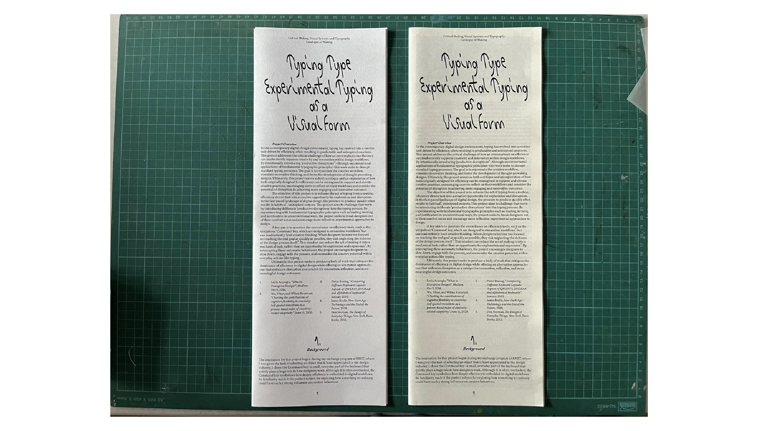
I printed the catalog twice—once on 80gsm and once on 100gsm paper. Initially, I was leaning toward 80gsm, especially after Vikas recommended it. The logic was simple: if the paper is lightweight enough, I wouldn’t even need to bind it traditionally. The paper would naturally fold and hold together, especially for saddle stitch. But there was one issue: 80gsm only came in cream or recycled tones. No pure white option. And personally, I really didn't vibe with the cream. It made the whole thing look slightly dull, and considering this is a design publication, presentation mattered a lot to me.
So I printed it again on 100gsm white paper. When I picked up the two versions and compared them side by side, the difference was immediately obvious. The 80gsm version felt a bit floppy. It was light, yes, but the minute I picked it up, I imagined someone else doing the same—and it bending. That was a no for me. I wanted it to feel sturdy, reliable. The 100gsm had that extra strength and structure I was looking for, and it felt more premium too. Despite the fact that it might require binding due to its weight, I felt more confident in how it held up.
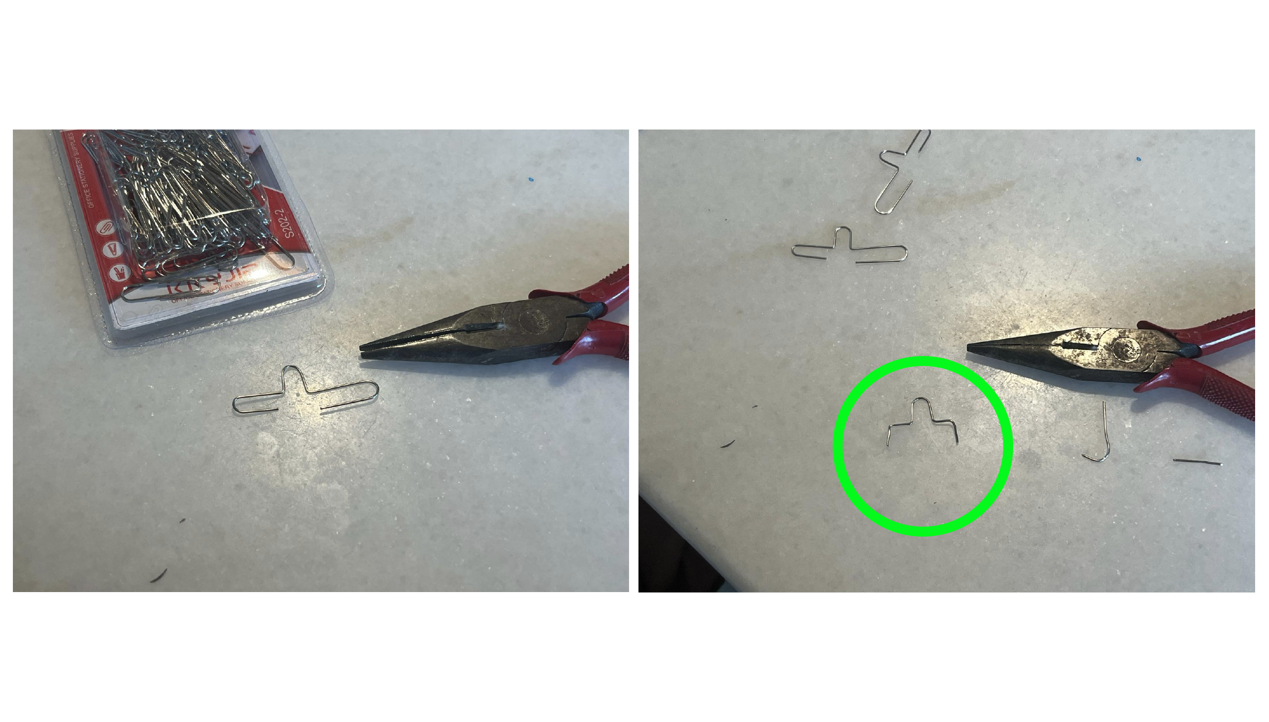
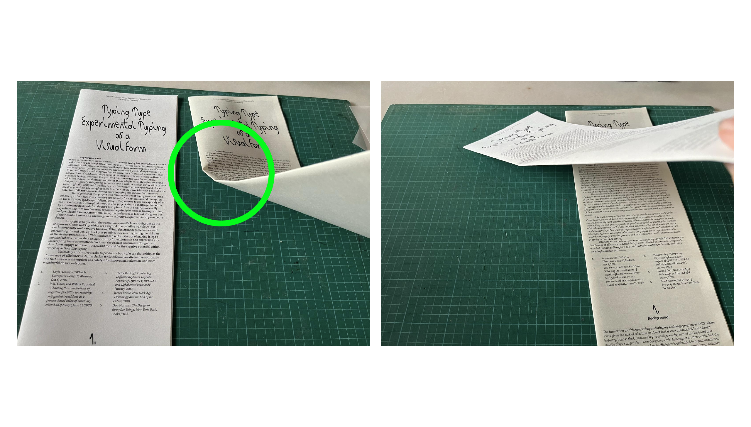
Binding was the next challenge. I originally intended to saddle-stitch the catalog myself but I was too afriad to messed up the publication with my badass sewing and I didn't wanted to print again cause in Week15 printer shops are constantly pack and I didn't wanted to waste my time to wait and print my stuff again so I decided to do the U stapler.
I’d never done this before, but a friend of mine, Carenza, had. She mentioned that it could be done with just a standard stapler and a paper clip as a guide. I gave it a shot, and my first few attempts were rough. I couldn’t get the staple to fold properly and align. But after some trial and error—and multiple do-overs—I finally got the hang of it. And honestly? It looked sick as hell. The staples were aligned, the bend was clean, and it looked like a legit, professional bind. I ended up quite proud of it (lol). It was minimal but tidy, and most importantly, it matched the simplicity I wanted from this project.
For the exploration publication, I was actually more satisfied with the 80gsm paper. Since this publication is meant to be playful and slightly chaotic, the lightness of the paper actually complemented the flipping experience. It didn’t flop weirdly like the catalog version, probably because it was a smaller and thinner booklet overall. The pages turned nicely, and it felt less like a formal object and more like something you’d casually pick up and interact with. So I stuck with 100gsm for that one, and no regrets there. lol.......
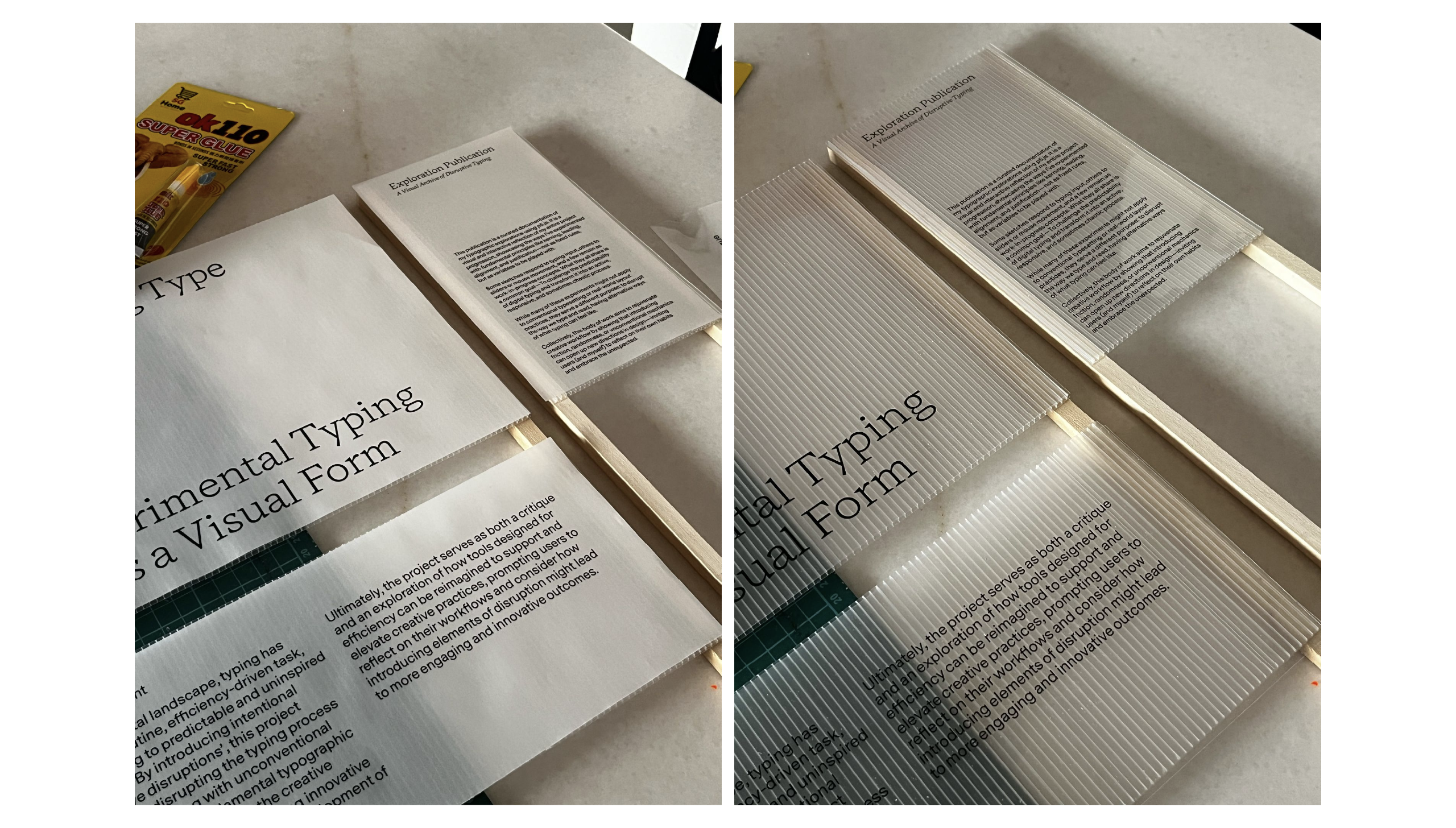
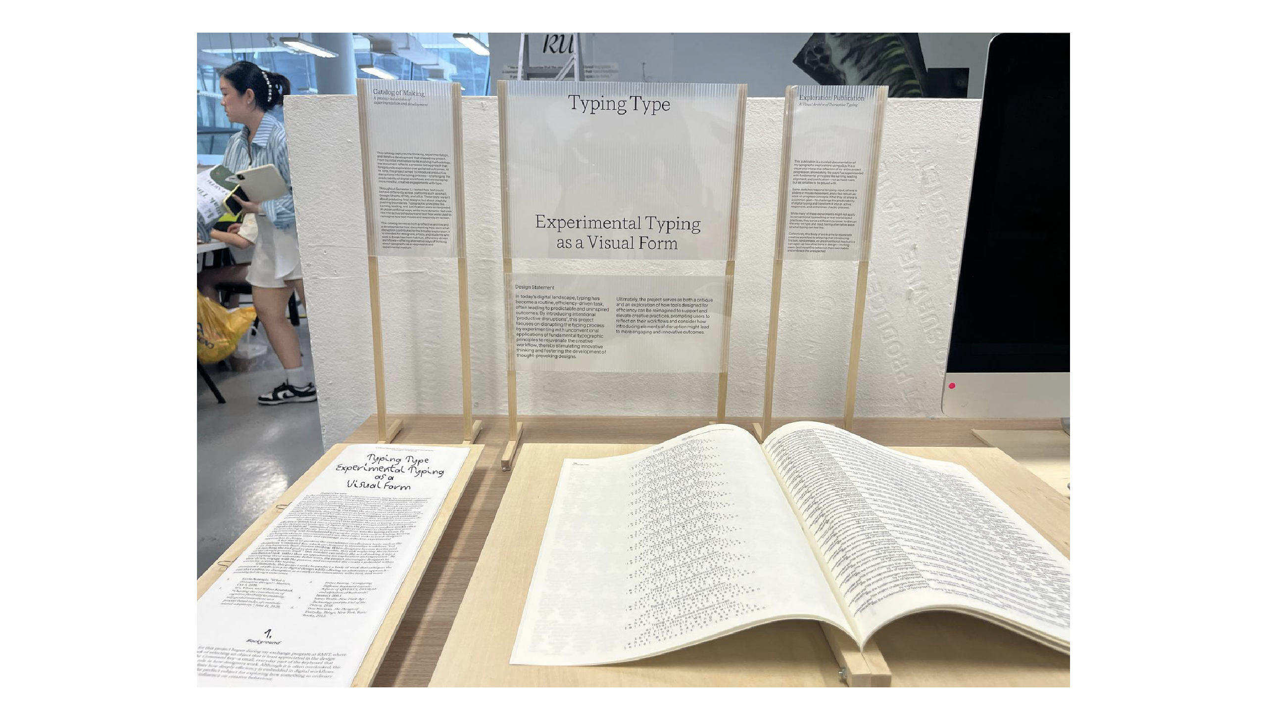
Next, I worked on printing my written descriptions. I printed them on two different materials: transparent film and translucent paper. After comparing both, I noticed that while the translucent paper was much easier to read, it didn’t have the “invisible overlay” feel that I wanted. I wanted the description to sit on top of the background plastic cardboard, letting the visuals come through subtly. The transparent version achieved that.
Yes, it’s slightly harder to read, especially with a textured background, but I decided that was okay. If someone really wants to read it, they can tilt it, move around, or adjust themselves. In a way, that friction is intentional—it makes reading a more conscious act. Also, I pinned the descriptions on a stick so that they would hang vertically instead of lying flat on the table. My table setup was already getting quite crowded, so using the vertical wall space was both a visual and spatial decision.
Now for the bittersweet part of the week: the coding. I genuinely tried my best to implement the “expansion page” feature for the Explainer Web, but it didn’t come together. I was frustrated not because I didn’t have time, but because the code became so messy and long that even with ChatGPT’s help, things started breaking. ChatGPT is amazing, don’t get me wrong, but with long and complex code—especially when there’s already custom logic—it can sometimes overwrite key sections or delete functions without warning. I kept finding myself in loops of trying to fix one thing and breaking another.
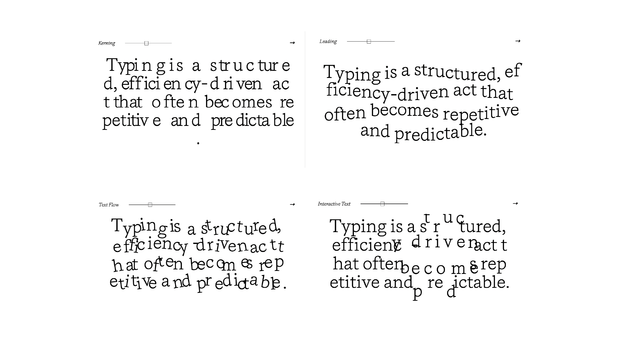
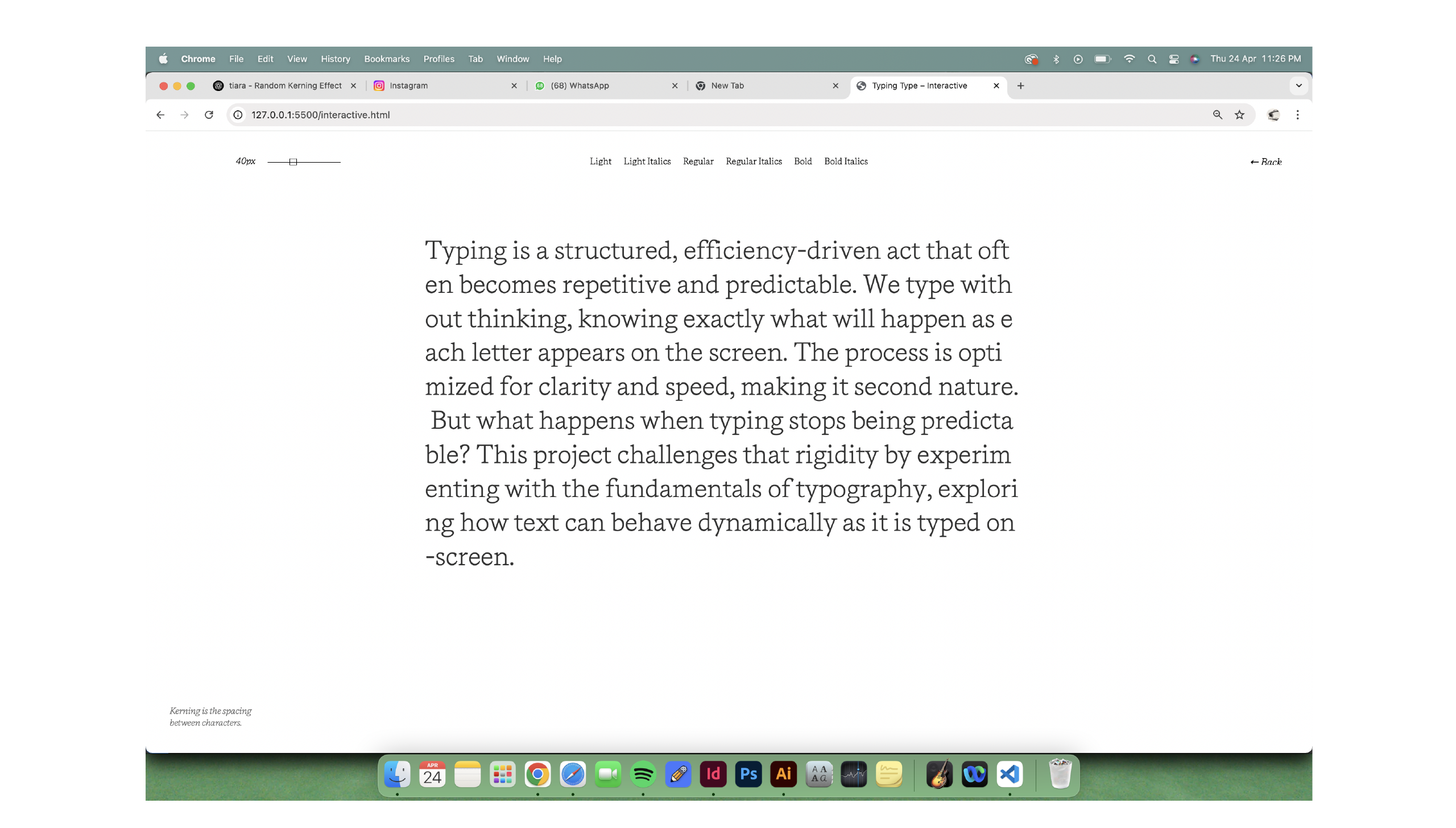
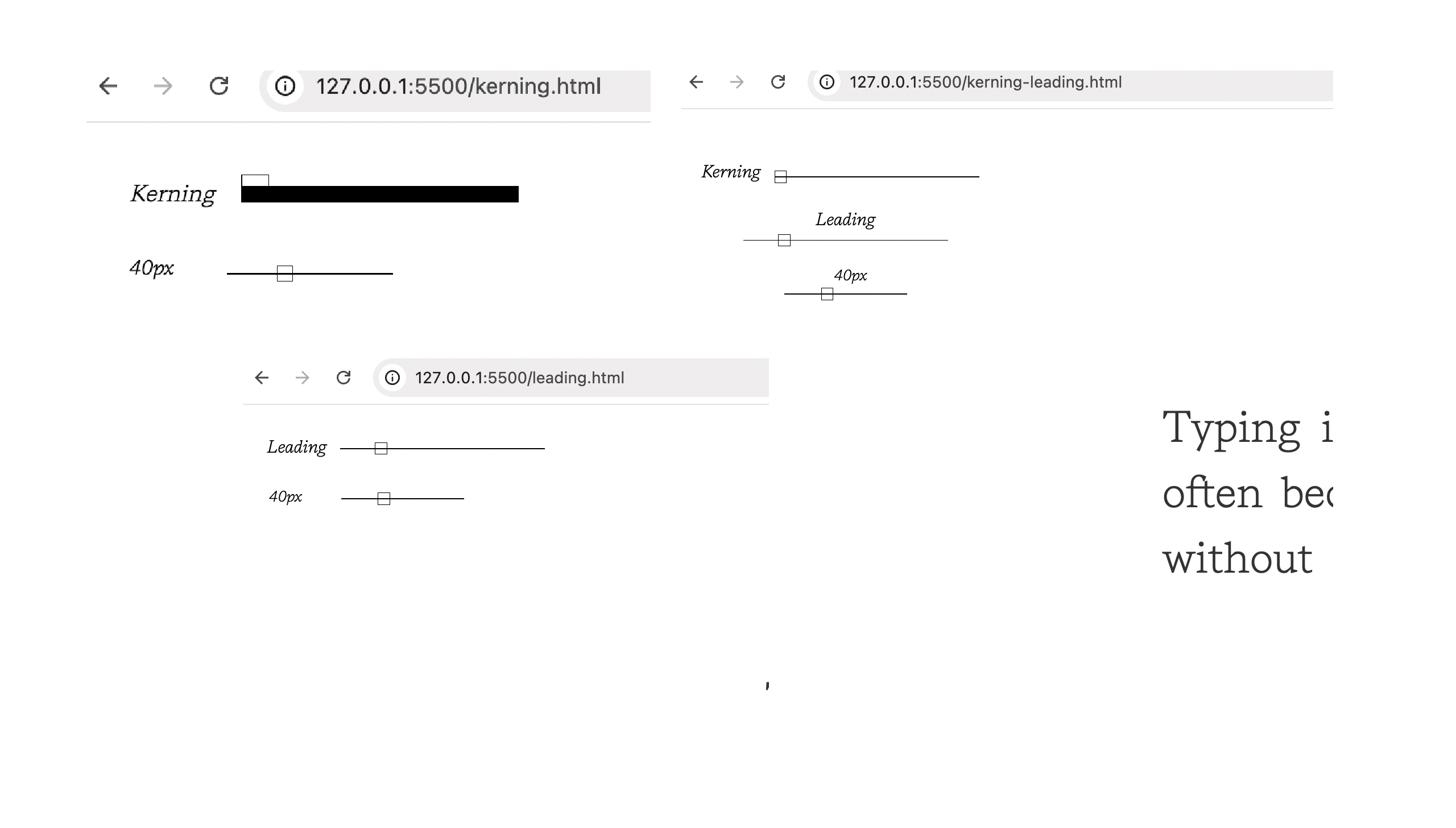
That said, I didn’t give up on the project. I just decided to shift my focus. Instead of stressing over an expansion page that wouldn’t work, I chose to refine what I already had: the main landing page. I updated all the interaction boxes—Kerning, Leading, Justification, Text Flow, Interactive Text—so that they each had some form of disruption built in. For example, the kerning box now has truly uneven spacing that reacts in real time as the user types. It’s no longer just a visual effect—it’s a lived experience. The leading box also has a bumpy rhythm now, and the other boxes follow suit with similar unpredictability.
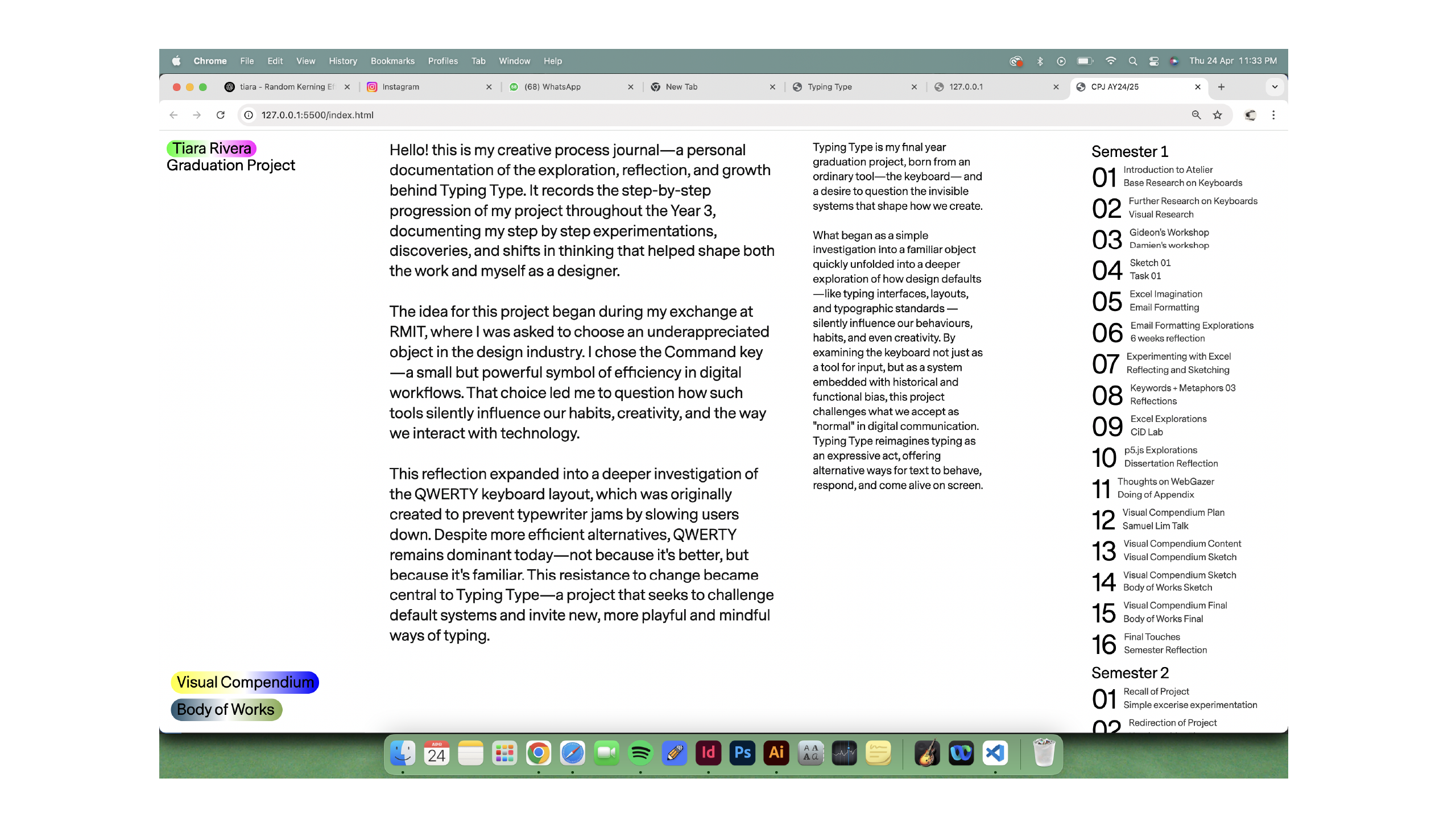
Lastly, I finally got around to coding my CPJ landing page. I went with a sidebar navigation and divided the main section into two parts. It’s clean, intuitive, and simple—nothing too experimental, just functional and easy to navigate. It helps contextualise all the work I’ve done over the semester and holds everything together nicely.
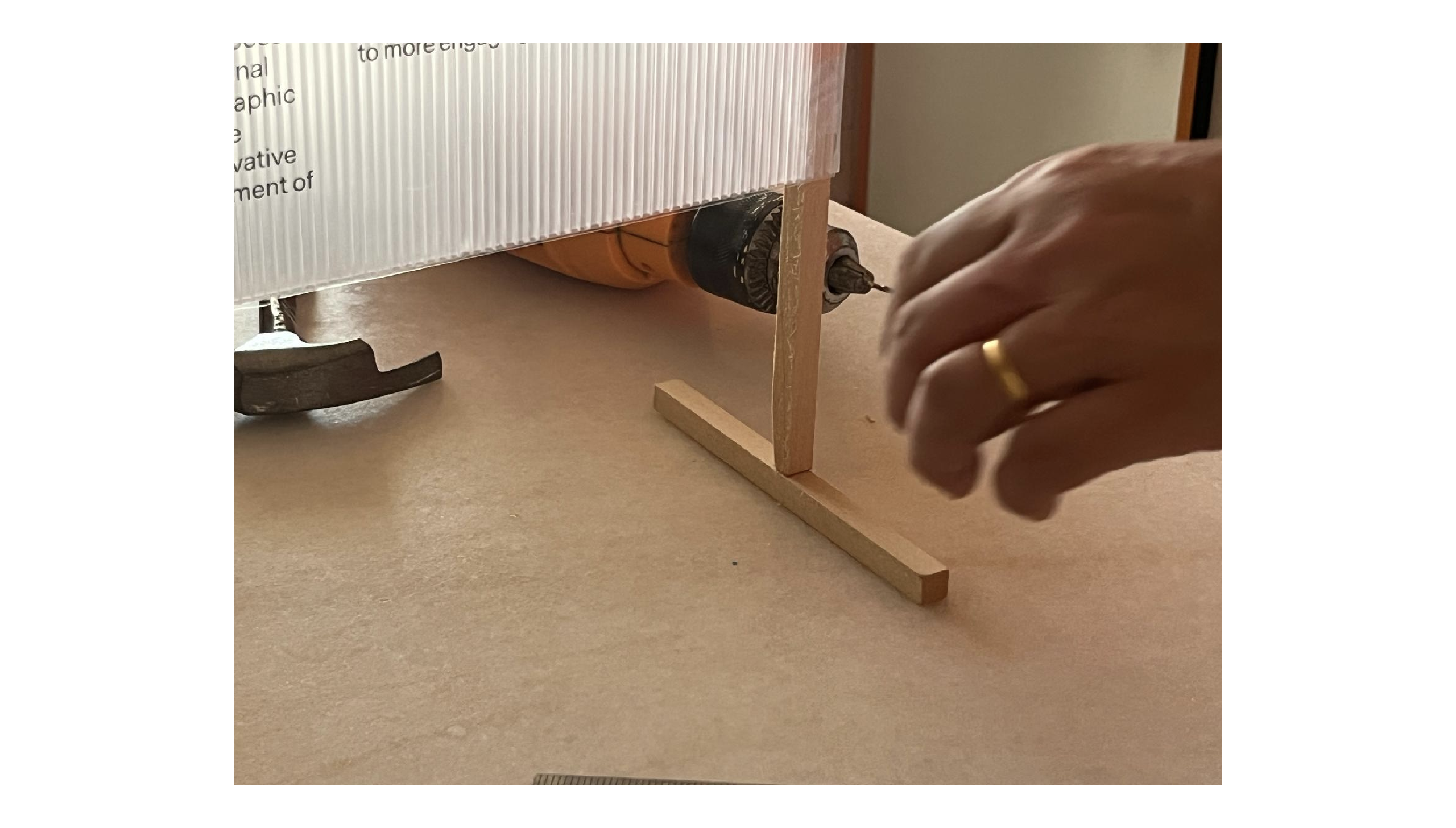
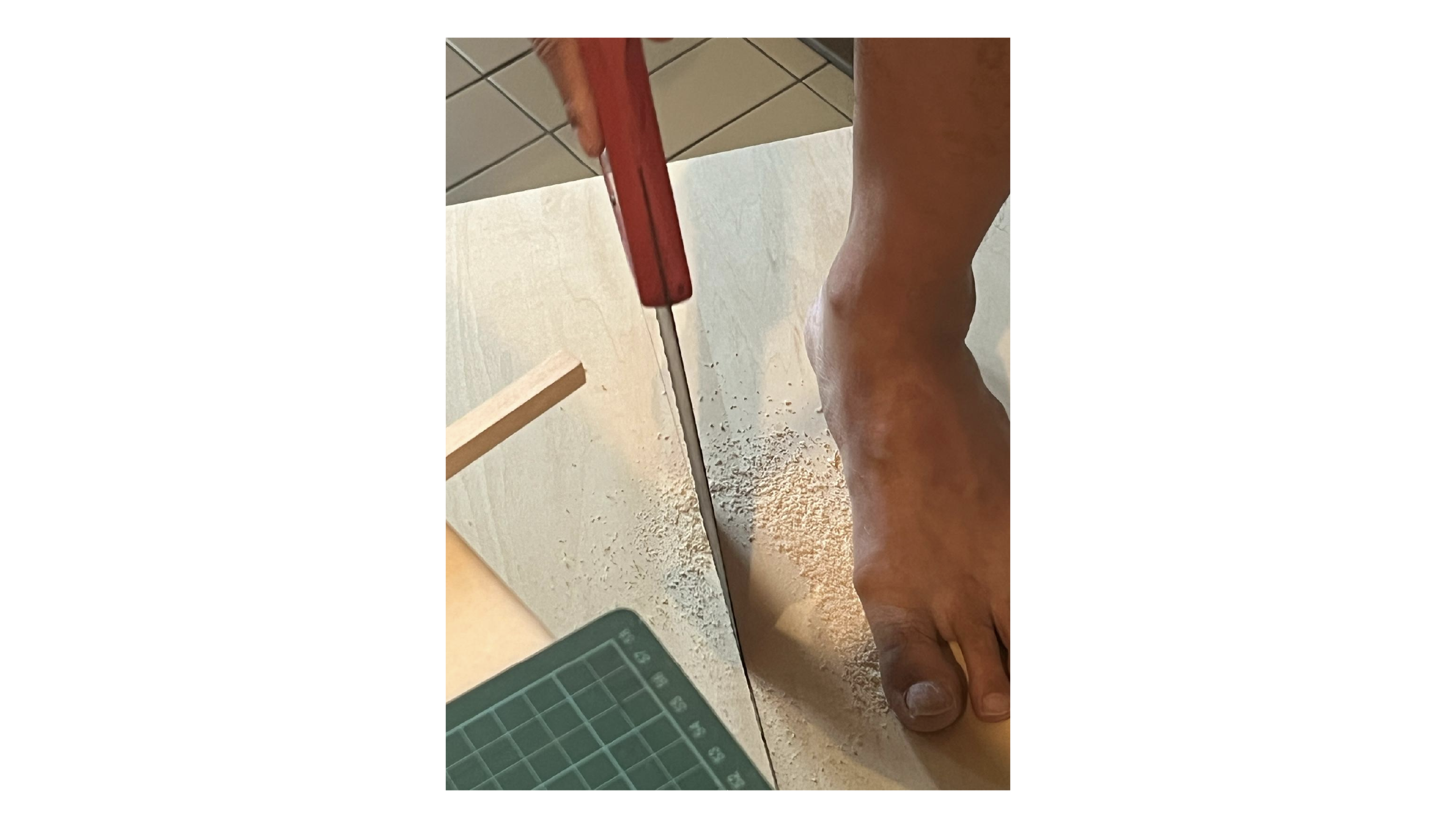
Before I ended this week, I had to set up my table, but the description stick was too long and too far from my deliverables. I felt it should be placed closer, so I went home and returned the next day, asking my dad to help me cut it. When I got home, I realized the stick couldn't stand on its own, so I had to cut additional pieces of wood to balance it and make it stand properly. I also took a photo of my dad helping me. Here is a part of his feet for helping him me in my project. Now your toe is in my CPJ pa.
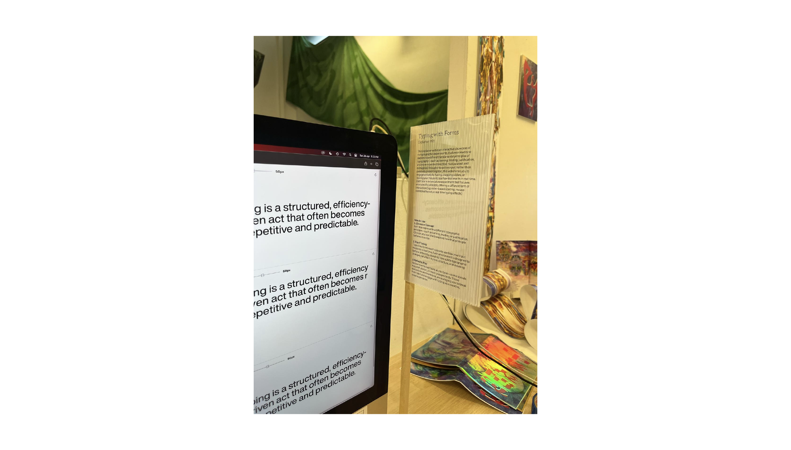
I also set up my table and added a description near the screen so users can understand how my explainer web works. Here’s a picture of my setup. I added extra height to the wood plank to elevate it slightly higher compared to the one I used during Open Studio.
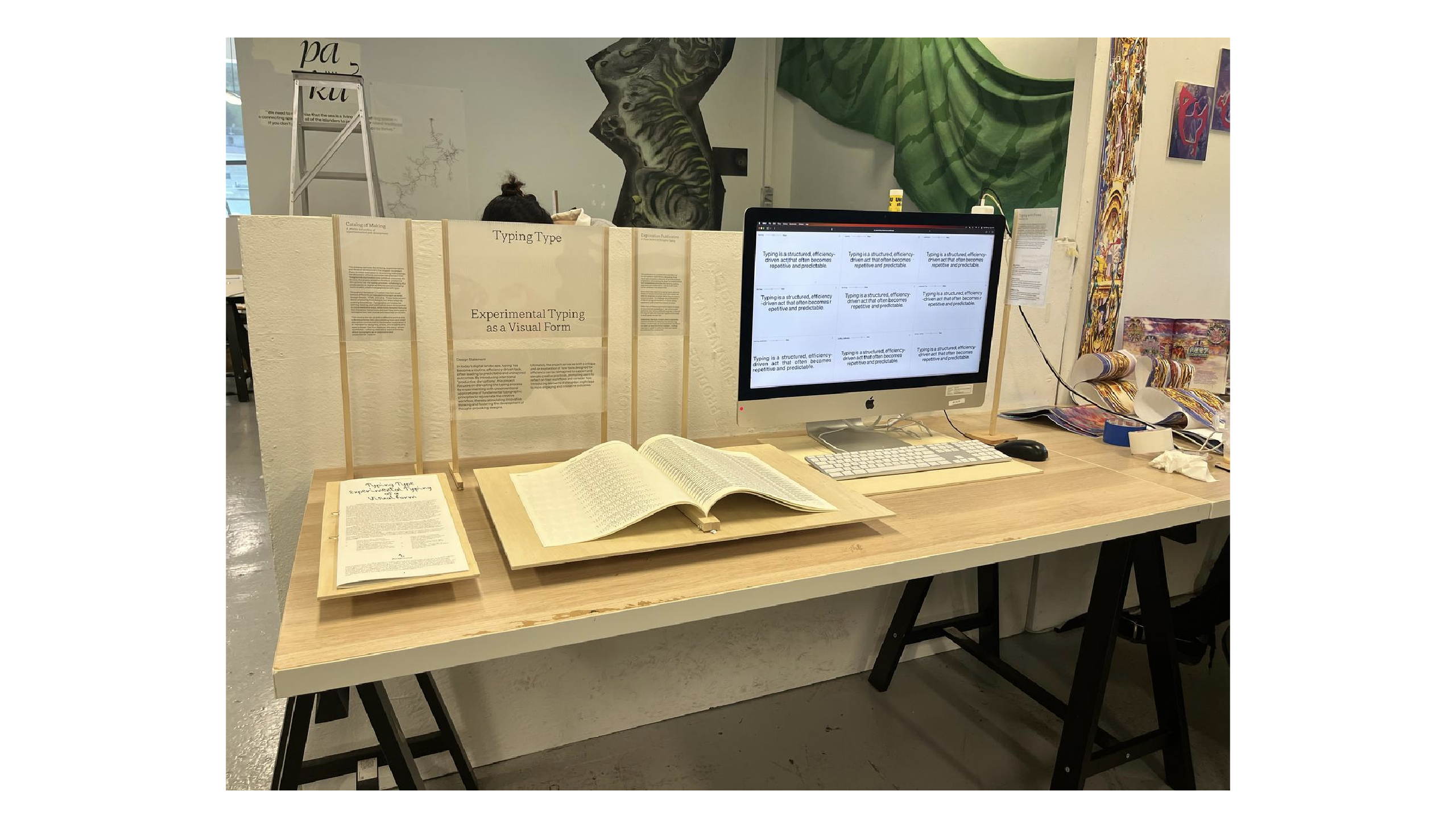
I wouldn’t say I’m completely pleased with my setup, especially after seeing others like Hwain who had better setups. Honestly, I don’t really know what to say — I just tried my best to make mine look as clean as possible. However, I am glad that my exploration publication p5.js codes are working and it is not bad.