
This week, I spent a lot of time trying to figure out what kind of placeholder text I want to use in my project. I thought it would be nice to have something a bit humorous, to keep the tone from feeling too serious. Last week, Vikas showed me some Singaporean advertisements that had really weird and funny scripts, and that got me thinking—maybe I could incorporate humor in my own way. So while scrolling through YouTube Shorts, I found this IT guy who makes jokes about keyboards (which is actually kind of relevant to my project). His captions were pretty funny, like "Only good developers use keyboards" or "I only got fast typing speed to offer her." Since my project is also about typing and interaction, I thought adding something like this would be a fun and lighthearted touch.
But when I brought this up in our group discussion, I got mixed feedback. Vikas said that humor isn’t necessarily bad, but there should be a good reason for using it. He pointed out that instead of picking random funny text, it would make more sense if my placeholder text was actually connected to my project. Since my publication is about showing different ways text can be displayed dynamically and abstractly on-screen, my placeholder text should help reinforce that. He suggested that instead of using random phrases, my text could describe what the project is exploring—like how text changes based on movement, how kerning, leading, and justification impact readability, or even something that reflects the act of typing itself. That feedback made me rethink my choice because it’s true—adding humor just for the sake of it might not add much meaning to the project. If the placeholder text actually ties back to my experiments, the whole thing will feel more cohesive rather than just being a collection of cool visuals.
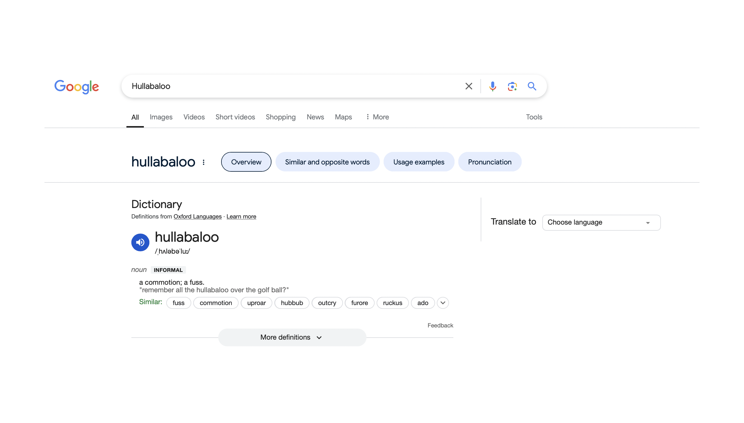
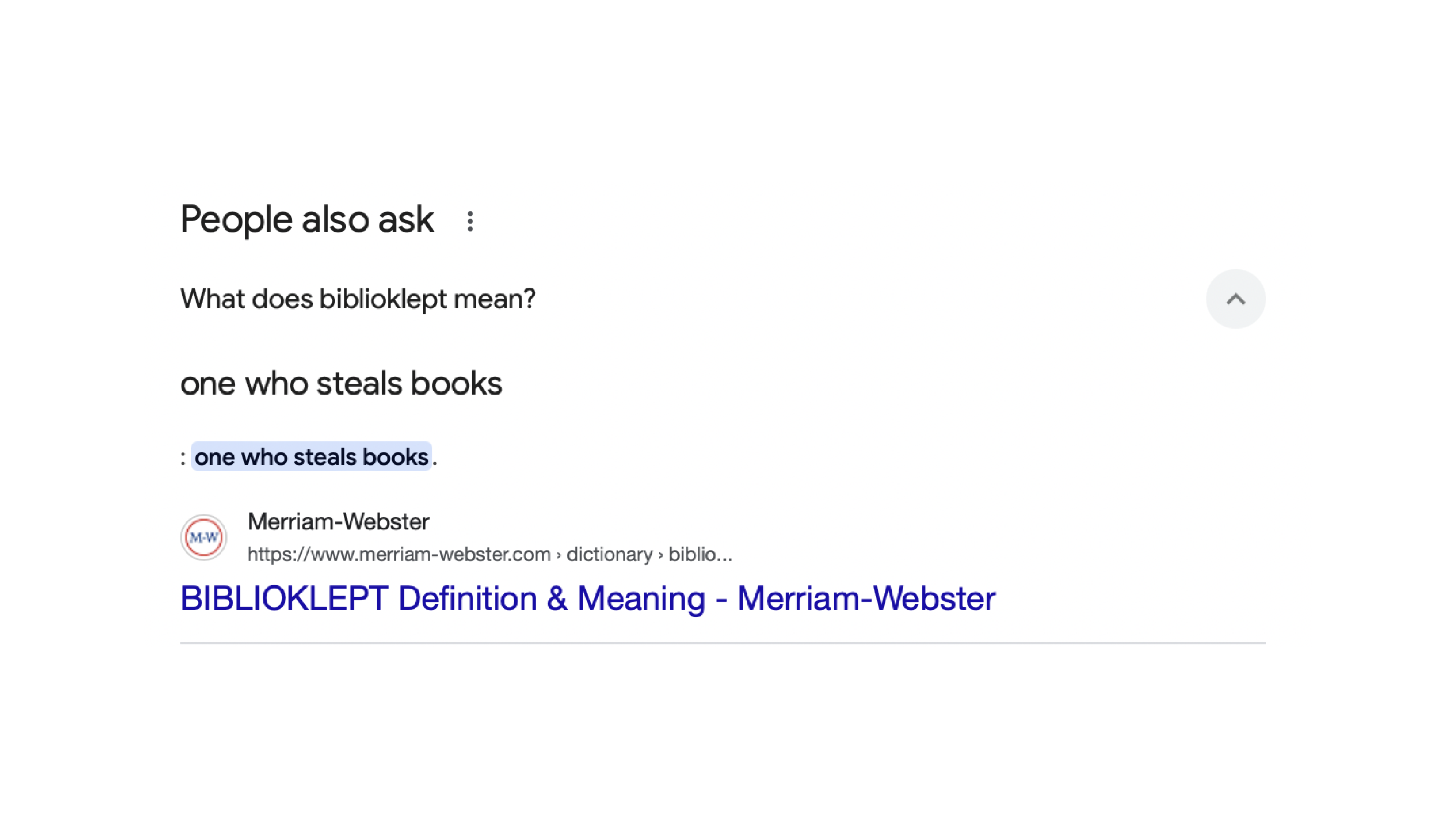
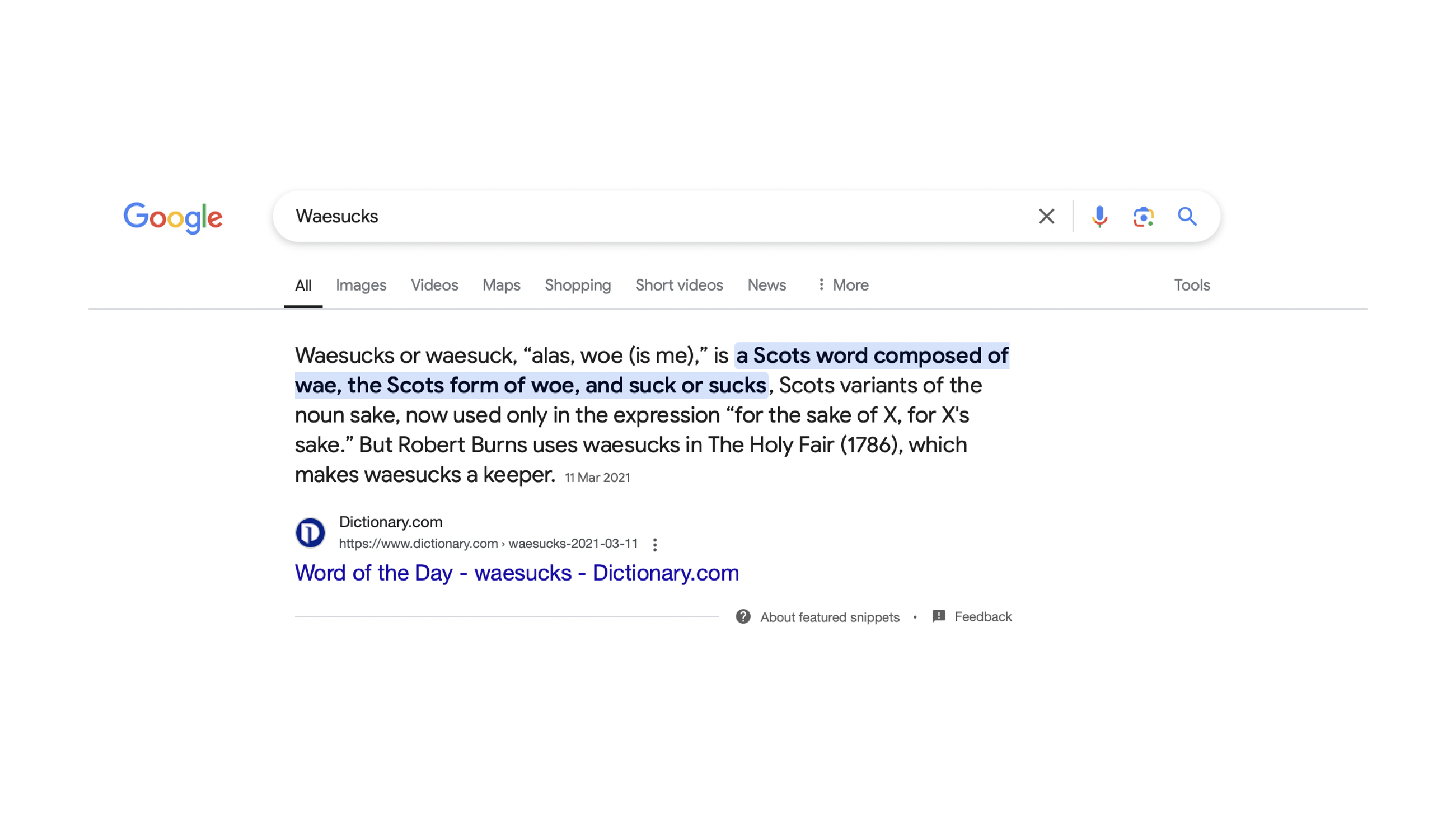
Another suggestion came from Hwain, who had a different approach. He said I could use words that have interesting sounds, like "Hullaballoo," "Biblioklept," or "Waesucks." These words already have a strong phonetic presence, which could be interesting because they naturally create a sense of rhythm and playfulness, similar to how I’m experimenting with text visually. I actually really liked this idea because it plays with sound, but I still feel like Vikas’s feedback makes more sense for my project. Having a placeholder text that describes or reinforces what I’m exploring will give my publication more clarity and purpose.
I also got feedback from Wei Ren, though this was more about how I arrange my experiments in the book rather than the placeholder text itself. He referenced the third image as an example and suggested that instead of just randomly placing my experiments, I should organize them in a way that makes sense—almost like a progression. For example, I could structure the book to move from kerning to leading to justification, creating a more intentional flow rather than just displaying a mix of different outcomes. That way, it doesn’t feel like a collection of disconnected ideas, but instead, a more thoughtful exploration of how text transforms.
These feedback really made me think more critically about my project and how all the elements connect. I still like the idea of adding a bit of playfulness, but I now feel like my placeholder text needs to be more intentional and actually contribute to what I’m exploring. It’s not just about making text visually interesting—it’s also about making sure the content itself makes sense within the context of my project.
For my publication, I definitely want the book to be able to open flat so that readers can see the full spread without having to hold the pages down. I think this is really important because I don’t want the binding or the paper to interrupt the way people observe the text placement. Since my project is about how text can be displayed dynamically and abstractly, I want the layout to be as seamless as possible—so the physical structure of the book should support that.
I also really like the idea of using textured paper. I think it would add a nice tactile experience, making the act of flipping through the pages feel more intentional. It’s something I personally enjoy when handling books, and I feel like it could enhance the way people interact with my publication. Right now, I’m just reflecting on how I want my book to feel and look because, to be honest, I’m still not entirely sure what kind of binding would be best for this. During feedback, I mentioned that since I want the book to open flat, I was considering open spine binding, but Vikas said that’s not the only option. He suggested that saddle stitch binding could also work, but I feel like that still isn’t flat enough for what I want. So, I did a bit of research and came across an example (refer to the pic) where the book is staple-bound, but what actually makes it open flat is the type of paper and its GSM.
The thing is, I’ve been experimenting with publications for a while, but I always end up doing the same kind of binding. I really want to push myself to try something different this time. I don’t want to just settle for what’s familiar—I want to find a way to make my binding more interesting and explore something new that I haven’t done before. I’ll keep researching and testing out different methods until I find something that really works for this project.
This week, I experimented with two different codes, but I’ll talk about this one first. It’s a modified version of a previous sketch, but this time, I wanted to create something more abstract. Instead of just focusing on kerning as a way to shape text, I wanted to explore patterns and repetition, making the text feel like it has a structured texture rather than just a readable form.
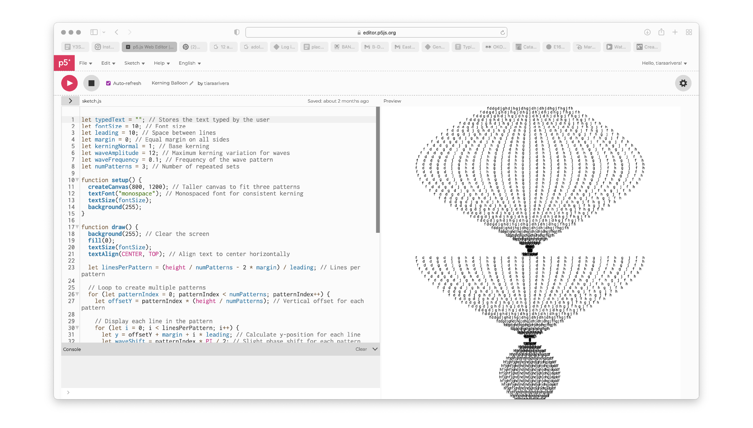
One of the main changes I made was introducing three repeated patterns (numPatterns = 3) across the canvas. Instead of having the text behave the same way throughout, I split the height into three sections and applied a slight phase shift (waveShift = patternIndex * PI / 2) to each one. This means that even though all three sections follow the same kerning wave effect, they are slightly offset from each other, creating more variation and movement.
Another key part of the code is how the kerning follows a wave pattern (sin(i * waveFrequency + waveShift) * waveAmplitude). Instead of keeping the spacing between letters static, it fluctuates in a rhythmic way, expanding and contracting as it moves down the canvas. This makes the text feel more dynamic and gives it a flowing motion, almost like it’s shifting as you type. I got to this point by experimenting with different wave amplitudes and frequencies to find a balance between structure and abstraction. At first, the effect was too chaotic, but after adjusting the values, I found a way to keep it visually interesting while still maintaining some order.
Reflecting on this experiment, I like how it shifts the focus from text as words to text as a visual form. The repeated structures add a rhythm, and the flowing kerning makes the text feel alive even though it’s static. Moving forward, I want to explore how I can push this concept even further, maybe by adding more layers of movement or experimenting with how the patterns evolve as people type.
Lately, I’ve been really torn between using code or Illustrator to create the 100 text placements for my publication. At first, I was really set on using p5.js because I liked the idea of letting the text generate itself dynamically. But as I kept experimenting, I started to feel like code was actually limiting me instead of helping. While coding does create interesting patterns and movements, it kind of stops me from fully controlling and exploring how text can be placed in a more intentional way.
With Illustrator, I would have complete control over every placement, alignment, and spacing without having to worry about whether the code can generate what I want. Right now, I feel like my goal is to showcase possibilities, and that means I need to be able to manually test out different layouts and experiment freely—something that coding doesn’t really allow me to do as easily.
So, I think I’ll focus on the publication first. I can still come back to coding later if I want to explore interactivity, but for now, I feel like it makes more sense to design the placements manually so I can really push the variety and structure of my experiments.