
Week 10 already… it’s kind of scary how fast time is flying. With only two weeks left till Open Studios, I’ve started to feel a bit more pressure, but also some excitement knowing that everything I’ve worked on is finally coming together. This week I focused mostly on refining both the publication and my user testing website, and just reflecting on what’s working, what isn’t, and what still needs to be done.
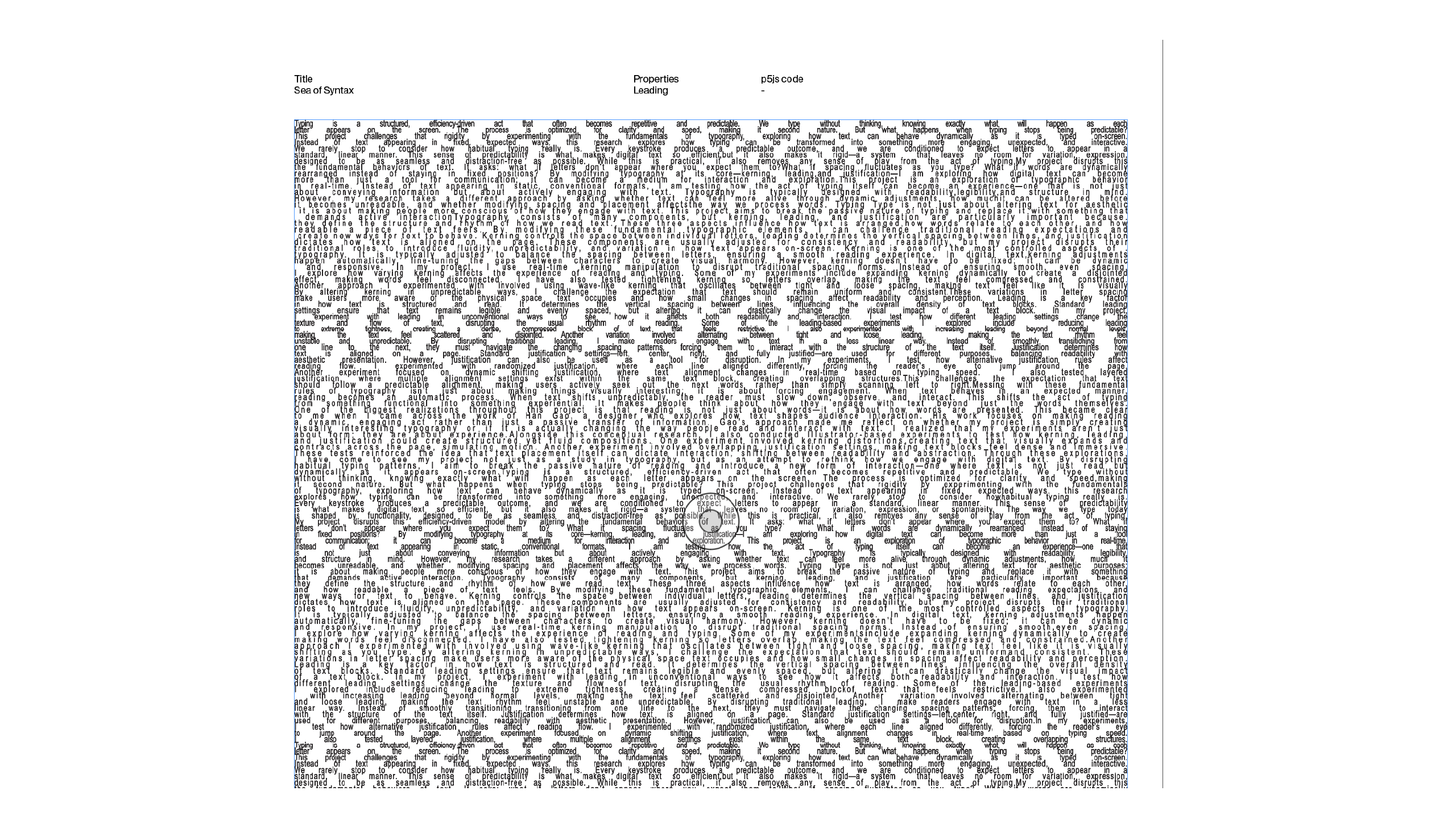
For the publication, I know one thing for sure—I really need to start inserting my actual placeholder texts. I’ve been relying on lorem ipsum for way too long, and it’s starting to bother me. It doesn’t say anything meaningful or reflect the purpose of the explorations. Like in the first image, I played with kerning as an example and finally changed the text, and it already made the layout feel more resolved. I’ve realised that the placeholder copy needs to do more than just fill space—it should carry the same energy and thought that the visual form is trying to communicate.
Now, something I’ve been struggling with (and honestly has been bugging me the whole semester) is coding. I mean... code really got in the way of how I work. I’m not naturally good at coding, especially with p5js. I keep getting stuck, and it takes a lot of energy to troubleshoot, especially when what I sketch or envision doesn’t translate exactly into code. Sometimes I want to ask Andreas for help, but I also feel bad or scared to disturb him. I can’t keep relying on others forever, so a lot of it becomes trial and error, and I just keep pushing through.
That said, even though the process feels frustrating, the outcomes somehow surprise me. I may not always get what I initially planned, but sometimes the glitches or unintended results turn out more interesting than expected. There’s something in that—like the idea that code itself can be a collaborator, not just a tool. And while I still hope to include p5js code for each experiment in my final publication, at the moment, they’re missing. That’s one con about my current book. It shows how I explored different ways text can appear on-screen, but the interactive side is still missing from it. My goal is by Week 16, every page will have its own p5js link so users can scan or type the link and interact with the exploration online.
But I have to say I’m quite happy with the outcome of the publication so far. It’s simple and clean, but it showcases the explorations clearly. Right now, I have about 15 experiments, and I’m hoping to hit 20 by the end. Coming up with ideas has been way harder than I thought. Like, in theory it sounds easy—just disrupt text—but when I actually try to do it, my mind goes blank. I’ve had a few mental blocks recently, maybe because I’ve been staring at this project for so long. But I’m still trying to push myself to keep exploring more variations and methods.
Now moving on to my user testing website. From the outside, it kind of looks like it’s done. The features are all there: you can type into the boxes, adjust sliders for properties like kerning, leading, justification, text flow, and text wrap. I also made sure that the text was editable and interactive. I even added a small hover feature—when you hover over a box, it changes to show the property being explored. It’s subtle but I think it adds a nice touch of feedback.
Link here.
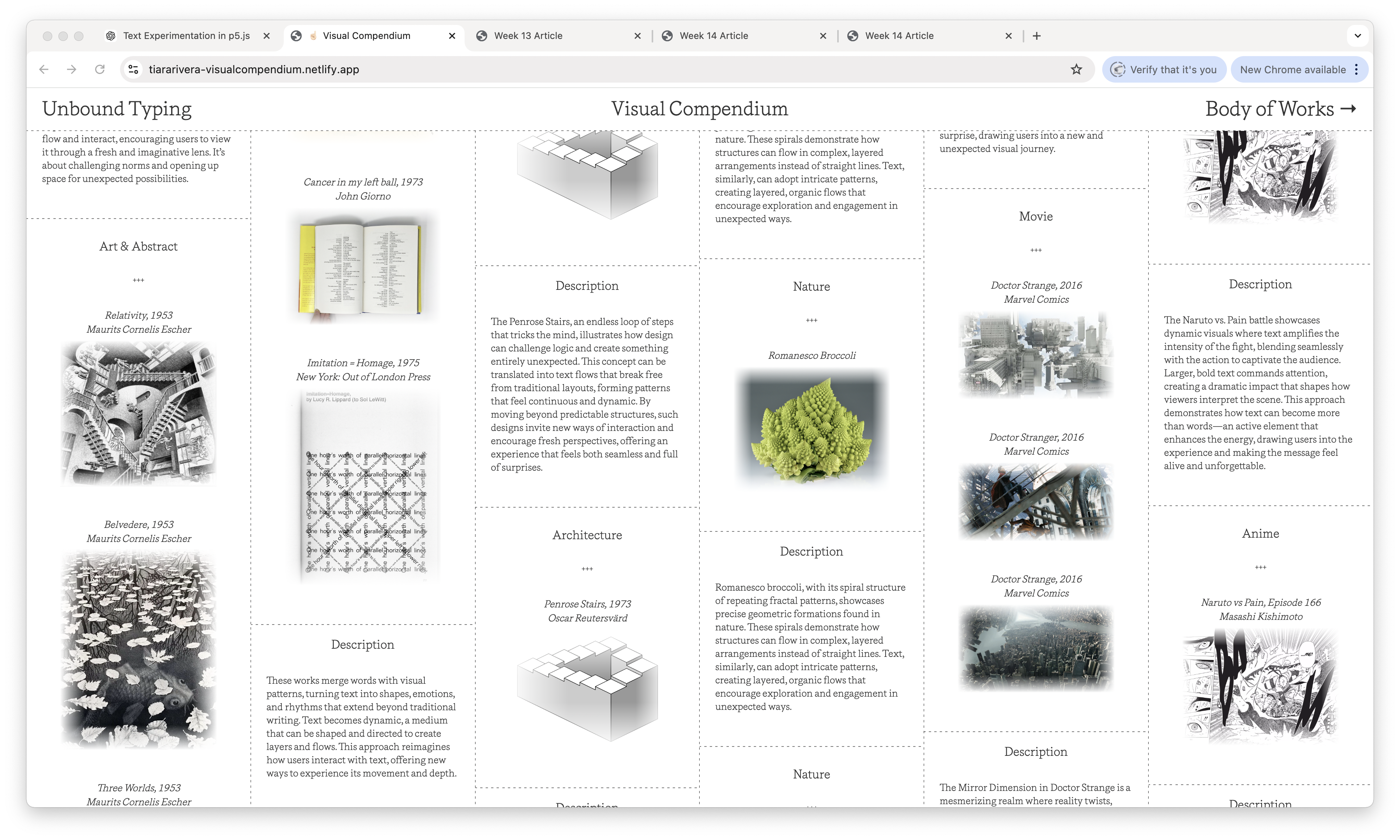
But to be god damn honest, I’m not entirely satisfied with the overall look of the site. It works functionally, yes, but visually it feels... bland? A bit too safe? I’ve been using Helvetica a lot, and while it always looks clean and nice, I feel like it’s a bit of a cheat code. Like you can throw Helvetica on anything and it’ll look decent. But it doesn’t say anything. That’s why I looked back at my Visual Compendium website (refer to the pic above) and realised that the feel of that site—its design, tone, and textures—resonated more with me. It had more identity, more intentionality.
So after Open Studio, I plan to recode the testing site to match the design language of the compendium. More personality, less generic UI. I want people to not just test the features, but to also feel something about how text behaves and appears. I’m also planning to add a button for each typographic property box. When the user clicks it, it’ll open up a full-screen dedicated version of that exploration. That means more space, more sliders, more ways for users to adjust and interact with the typography in a deeper way.
Overall, this week was kinda frustrating but I’m getting a better sense of what I want the final experience to feel like, and I’m also coming to terms with what I need to do to get there. There’s still a lot of little things to clean up, from inserting text in the publication to styling the website to feel more intentional. But I’m glad I’m noticing these things now instead of later. With two more weeks to go, it’s just time to push myself a lil harder I guess...