
One more week left till Open Studio starts, and things are definitely starting to feel more real now. It’s that weird feeling where you’re excited but also kinda anxious at the same time because you just want things to come together nicely. But honestly, I feel like I’ve made peace with my project’s direction—and I’ve decided to just keep it simple and intentional.
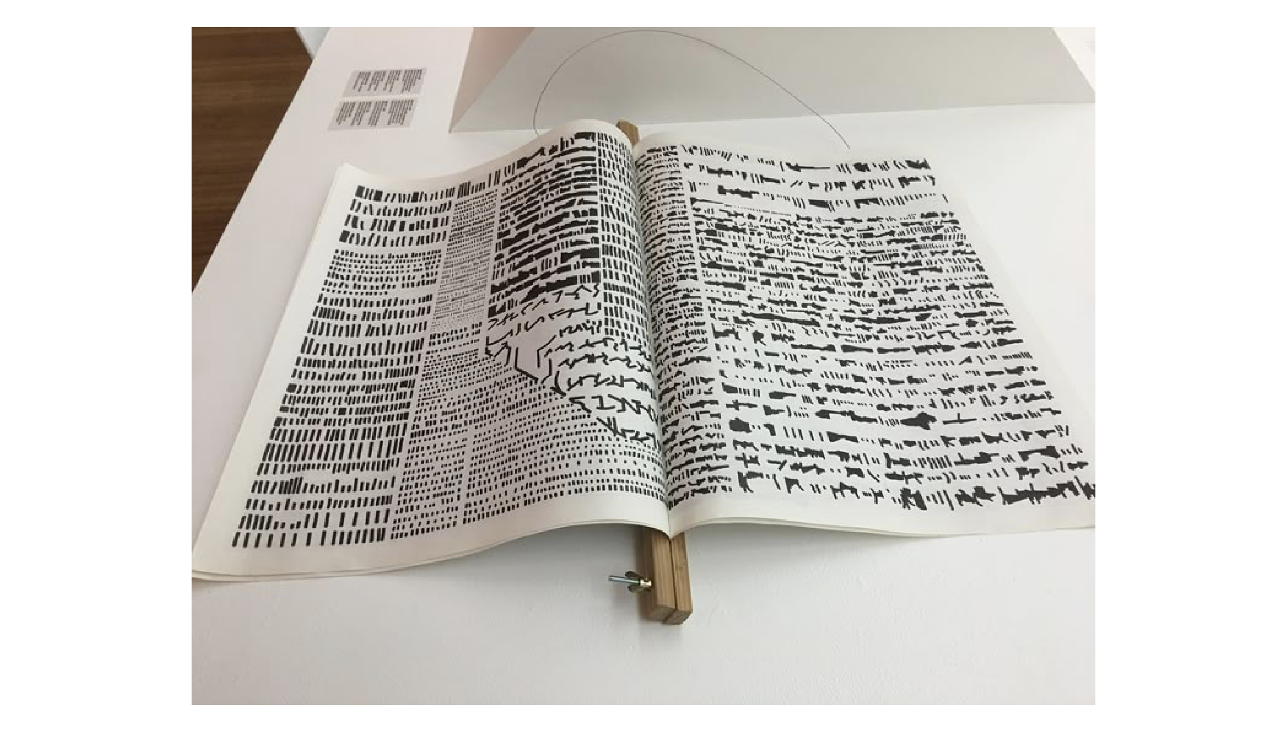
This week, I finally placed an order for my paper from RJ Paper! I went with the 100gsm Maple White. I specifically chose this paper because I wanted something soft and light—it gives off that gentle newspaper feel that flips easily. There’s a really subtle texture to it, and if you shine it under light, it has this nice matte sheen—not super obvious, but still a nice touch. I wanted my publication to feel light and tactile in a way that mirrors the experimental and fragile nature of my typography explorations. It's a small detail, but I feel like it adds to the experience of flipping through the book.
Now about the binding… I originally thought of doing a saddle stitch because I love how clean and flat it makes a book look when it opens. But since my publication size is just slightly smaller than A3, that would’ve meant printing on A2 paper. The issue is: I couldn’t find a print shop that would let me print on A2 using my own paper instead of poster stock. And on top of that, time was just not on my side. So I pivoted.
Link here.
I was scrolling and stumbled across this design—it’s a newspaper-style wooden clamp bind, and I thought it was perfect. It’s simple, and more importantly, it solves my binding issue without needing to fuss over complicated printing logistics. The best part? My dad could help me make it. All I had to do was get the wooden dowels and screws from Art Friend, drill a hole through, and that’s it. I didn’t manage to document the process of building it (I kind of just dove straight into it with my dad’s help), but I’m actually really happy with how it turned out. It feels raw but considered, which I think fits the tone of my whole project.
Link here.
I’ve also been thinking a lot about how I want to display everything for Open Studio. I've made the decision to only showcase two main things: my publication of all the text explorations and my user testing website. And honestly, I think that’s enough. I didn’t want to fill my table with stuff just for the sake of it. I know some people like to add props or printed posters, but I didn’t want to include anything that didn’t directly contribute to the point of my project. I’d rather keep it focused. I mean I could design a poster for my project but what is the poster going to be about? I am not doing a workshop/ a event for my project..
Link here.
So the challenge was, how do I display these two elements in a way that feels put-together and clean—especially since my table is a bit rough around the edges. Parts of it are peeling, and honestly, it just looks messy. That’s when I thought about elevating the book with a piece of wood underneath. I was inspired by these types of display setups. They just feel more curated. By elevating the book slightly, not only do I avoid drawing attention to the table’s surface, but it also makes the book feel a bit more special—like it’s meant to be interacted with, not just glanced over. It brings it to eye level a bit more and gives it presence.
The publication will be the physical anchor of my project. It holds all of my explorations on how text can behave and appear differently on-screen, but now translated into print. Even though some pages don’t yet have the final p5.js code attached (something I really hope I’ll be able to include by Week 16), I still think it does a good job of communicating my research and experimentation. It’s simple, but it’s honest. I’m hoping to push it further by aiming for around 20 explorations—I currently have 15, and coming up with new variations is getting harder. It’s funny how something that sounds so open-ended—"playing with type"—can get creatively draining once you’ve exhausted all the obvious ideas. But I’m trying not to stress too much and just let the ideas come.
For the website, I feel like it’s nearly done in terms of functionality. You can type into each section, play with the sliders, and interact with the typography settings in real time. But if I’m being honest, I’m not 100% satisfied with how it looks. It works, but visually it doesn’t quite carry the same energy as my visual compendium site. That one felt more refined, less "default template"—and also, no Helvetica. Not that I hate Helvetica, but it’s such a safe option that it kind of makes everything look effortlessly decent without much effort. I feel like, if I’m going to do this project properly, it needs to carry a more distinct personality. So after Open Studio, I plan to redesign the user testing website to match the visual tone of my compendium.
One more thing I’d like to add to the site is a button for each box. When clicked, it would expand into a dedicated page where users can really dive into one specific typographic setting—like kerning, leading, justification, etc.—and adjust it with more advanced sliders. I think this will allow for a deeper exploration instead of just hovering and tweaking on the surface. Right now, it gives users a taste of what’s possible, but I want to push it further and allow more customisation. I guesss so far my project is going in a steady speed, so I'm pretty calm compared to most of my classmates. Lol.