
Ill be discussing Vikas’s feedback on my presentation from last week, I’ve received a few good feedback to improve on my ideas. Such as the publication I’ve talked about,
Link here.
This Malaysia-based designer experiments with visual storytelling through typography in a really unique way. I found his work particularly interesting because, while he primarily uses type as his medium, he doesn’t just treat it as a tool for conveying words—he plays with its form, structure, and composition in an abstract way. His approach goes beyond traditional typography; he manipulates letterforms, integrates shapes, and explores unconventional layouts to create something visually engaging and dynamic. I really appreciate how he transforms type into a design element rather than just a means of communication, making it feel more like an artistic expression. The way he blends abstract shapes with text adds another layer of meaning, making the work feel more fluid and open to interpretation. It’s inspiring to see how typography can be pushed beyond its conventional use, and it makes me want to experiment more with form and abstraction in my own work.
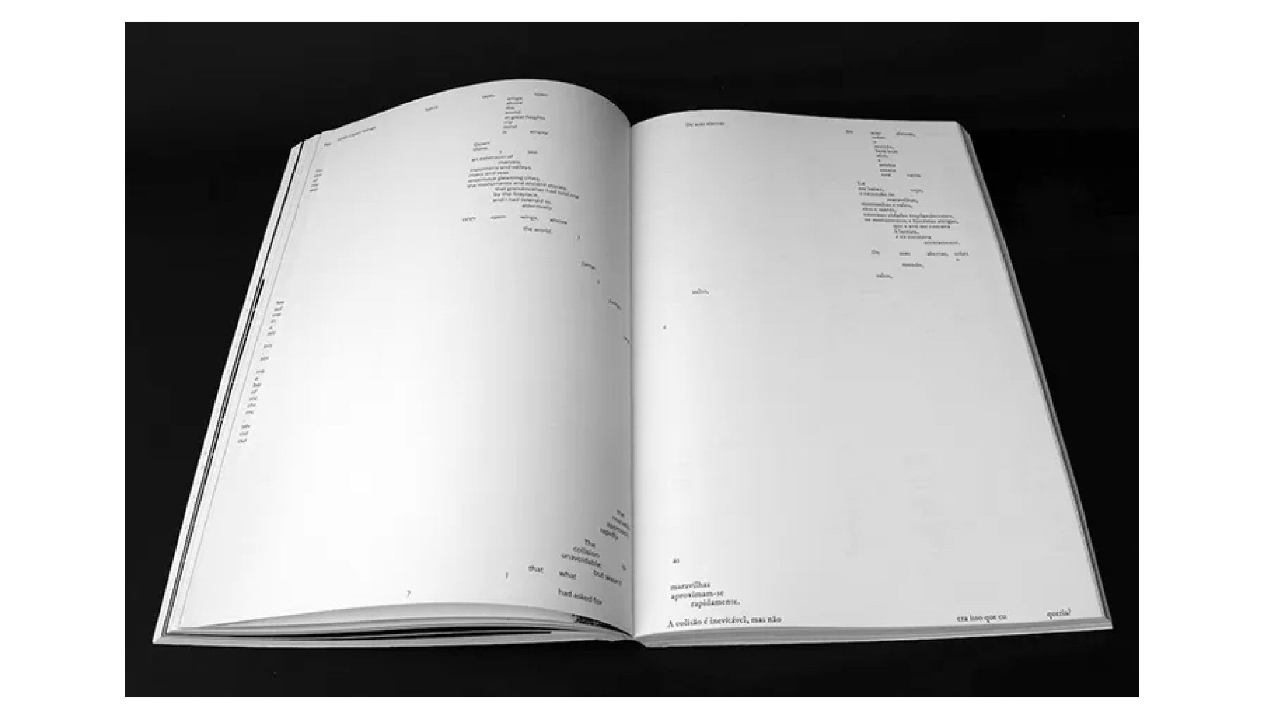
This exploration of typography and interaction has made me realize just how many possibilities there are in how text can be visually represented on screen. Inspired by designers who push the boundaries of type, I decided to create a publication that documents (hopefully) (reading this at week 16, lol 100? I must be out of my mind) 100 different outcomes. There are endless ways my project could develop because there are endless ways text can appear and behave dynamically as we type. Instead of settling on a single approach, I want to embrace experimentation, allowing the project to take different forms and evolve through trial and discovery. By compiling these explorations into a book or publication, I can create a tangible record of all the different directions I’ve explored while also providing a structured way to present them.
This publication won’t just be a collection of experiments—it will be a way to reflect on how typography can be reimagined when we let go of traditional constraints. Through this process, I want to uncover how text can be more than just a static element and instead become an active, evolving experience. Each outcome will contribute to a broader understanding of how we interact with type, whether through movement, spacing, rhythm, or abstraction. By bringing everything together in one place, I hope to highlight the creative potential in breaking habitual patterns of typing and to inspire new ways of thinking about how we engage with text in digital spaces.
Another plan for my table presentation is to let people interact with the project instead of just looking at static examples. I want to set up a laptop or tablet where users can type and play around with kerning, leading, and justification in real time. This way, they can actually see how text changes based on their input, making it more engaging and hands-on. I think this will help show that typography isn’t just fixed—it can be fluid and responsive. Alongside this, I’ll also display prints or screenshots of some key outcomes from my past experiments, so there’s a mix of both digital and physical elements. This setup will let people explore the different ways text can behave while keeping things simple and easy to understand.
Vikas brought up an interesting point about placeholder text in my project. Right now, I’ve been using random words like "fragment" just to test out the visual structure, but he suggested that adding a more intentional placeholder text could make my publication feel more cohesive. Instead of just having scattered words, the text could form a story or a pattern that makes sense as people read through it while still maintaining an interesting and experimental arrangement. This would help bridge the gap between the visual exploration of typography and actual readability, making the project not just an abstract exercise but something more engaging for the viewer.
Link here.
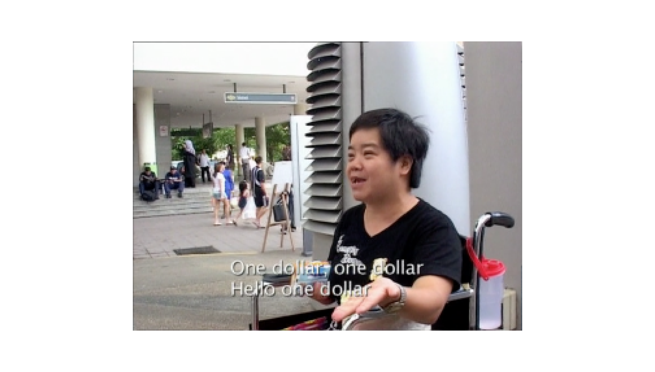
One reference he mentioned was the Singaporean film Singapore GaGa (2005), particularly the part featuring the street busker who repeatedly chants “One dollar, one dollar, hello one dollar.” The rhythm in the way she speaks gives it a sort of musical quality, almost like a spoken-word pattern or poetic repetition. I thought it could be interesting to bring in a Singaporean touch like this—something that resonates locally and also carries a sense of rhythm that ties into how I’m playing with text and structure. I hadn’t really thought about incorporating a local element, but it’s an interesting idea to explore. The way she speaks naturally creates a structured repetition that fits into what I’m already experimenting with in terms of text formatting and rhythm.
Vikas also talked about "found poems", which I found pretty funny. He mentioned that sometimes, when he’s in meetings where things don’t make much sense but somehow still rhyme or have a certain rhythm, he finds it amusing. This idea of pulling phrases from everyday conversations and turning them into text-based compositions makes me think about how language naturally falls into patterns, even when unintentional. It’s like taking something chaotic and finding structure in it, which could be an interesting way to rethink placeholder text. Instead of just writing filler words, I could use snippets of real speech, giving the text a more organic and dynamic feel.
Another idea he shared was using random internet finds as placeholder text, especially things that are unintentionally funny. He showed me a post where someone compiled weird and awkward YouTube ad scripts, which had this bizarre, almost nonsensical way of wording things. There’s something really compelling about using text that was never meant to be poetic or artistic but, in a different context, suddenly becomes intriguing or humorous. This could be a cool way to experiment with how text is perceived—if you take something out of its original context and present it differently, does it take on a new meaning? It also aligns with my interest in breaking habitual patterns of reading and typing because people wouldn’t expect placeholder text to be something absurd or oddly structured.
Vikas also told me to think about how the book itself can be more playful, not just in terms of the typography but also in its physical form. Right now, I’ve mostly been focused on how text behaves on screen, but I haven’t really thought about how the actual printed publication could feel just as dynamic and experimental. He suggested that instead of sticking to a standard book format, I could explore ways to make the reading experience more interactive—maybe by changing how the pages are structured, cut, or folded. It made me think, how can I make the book feel like an extension of my project rather than just a documentation of it?
One thing he mentioned was paper sculpture, which I thought was interesting. It’s about using paper in a way that adds dimension—maybe layering, folding, or cutting pages so that text isn’t just printed flat but interacts with the physical form of the book. Instead of flipping through pages in a linear way, what if the book forced readers to engage differently? Maybe certain words are hidden until the pages are unfolded, or certain sections have overlapping text that changes depending on how it’s viewed. It got me thinking about how typography isn’t just about what we see but also how we experience it, and if I’m already breaking the structure of text in a digital space, why not do the same with print?
He also talked about experimenting with print techniques, like using different paper textures, transparencies, or even alternative ways of binding the book. There’s a lot I can do beyond just printing my screen-based experiments in a book format, and I like the idea of making the physical book just as unpredictable as the text inside it.
I haven’t fully figured this out yet, but I know I don’t want the publication to just be a straightforward collection of my work. If I’m already challenging how text appears and behaves, then the way it’s presented should reflect that too. I need to think more about this, but it’s exciting because it opens up so many possibilities for how people can experience my project in a more tactile way.Now I will be talking about the p5js sketch i worked on this week,
This p5.js sketch lets people interact with text as they type, creating a triangular text arrangement where the spacing between letters changes based on the line position. Instead of just typing normally, the kerning shifts every few lines, making the text expand outward and then come back in, kind of like a Christmas tree shape. My intention with this was to play with kerning in a way that makes it visually interesting as you type, rather than just being a background setting in typography. I wanted to see how something as simple as adjusting letter spacing could completely change how text is structured and experienced.
One part of the code that makes this work is the kerning multiplier, which changes every six lines (i % 6). This makes some lines tighter while others spread out, creating the shape. Another key part is how the text is centered, so it doesn’t just start from the left but instead adjusts to keep everything aligned properly.
The fun part about this sketch is that it’s interactive—you’re not just typing; you’re actually shaping how the text looks as you go. The way the kerning changes in real time makes the act of typing feel more intentional instead of just automatic. It’s a simple but effective way to experiment with letter spacing and see how it can influence the way text takes shape visually.
This p5.js sketch is another way of playing with kerning, but this time it feels more immersive because the text fills the entire canvas, creating a dense visual effect. Unlike my previous sketches where kerning created shapes or patterns, this one builds a textual texture—even though it’s just 2D text, the way the letters are spaced gives an almost tactile feeling. When looking at it, it feels like you could run your fingers over it and sense depth, even though it’s just a flat arrangement of text. The way the kerning expands and contracts in a looping cycle creates a pattern that makes the text feel woven together, like fabric made of words.
The code works by adjusting the kerning based on the line number, with a cycling pattern (i % 34). The spacing increases for 17 lines and then reverses for the next 17, creating a heart beat effect that makes the text expand and contract in waves. Another important part of the code is how it centers each line by calculating its width before placing it on the canvas. This keeps the text structured and balanced rather than just flowing from left to right.
What makes this sketch exciting is that it’s interactive—as you type, you’re not just entering text; you’re actively shaping how the texture forms. The more you type, the more the canvas fills, and the deeper the pattern becomes. It’s a really interesting way to explore kerning not just as spacing, but as a way to create visual rhythm and depth, turning simple text into something that feels almost physical.
This week, I spent a lot of time experimenting with kerning and text arrangement, and I’m starting to see how much it changes the way text feel when I typed. At first, I was just playing around with spacing, but now I realize that kerning can actually be a design tool on its own. The biggest thing that stood out to me was how text can create texture—even though it’s just 2D, the way the letters expand and contract makes it feel almost tactile, like something you could touch. I didn’t expect that effect, but now that I’ve noticed it, I kind of want to push it further and see how much more I can do with it.
Another thing I realized is how interactive my project is becoming. My p5.js sketches aren’t just about displaying text—they actually react as I type, which makes the process feel more engaging. Instead of just typing mindlessly, every key I press affects how the text looks, which makes me way more aware of spacing and rhythm. This ties back to what I wanted from the start—breaking habitual typing patterns and making people more conscious of how they interact with text.
Talking to Vikas also gave me some new ideas, especially about placeholder text. Right now, I’ve been using random words like “fragment,” but he suggested using something with rhythm—like the “one dollar” phrase from Singapore GaGa—or even found poems from everyday speech. That made me think about how text can have meaning beyond just how it looks. Maybe I should be more intentional with the words I use so they actually add to the experience instead of just being fillers. Overall, this week really changed the way I see my project. It’s not just about making typography look cool—it’s about rethinking how people type and interact with text. Now, I want to start thinking about how all of this will translate into print and publication, making sure the final outcome feels just as experimental as my digital sketches.